This chapter introduces you to the basic skills that you
need to work with the GNOME Desktop.
Even if you are very familiar with mouse devices, you should
still familiarize yourself with the button conventions and action terminology
used in this manual. This section also describes the mouse pointers.
All the instructions in this manual are for the following
types of mouse devices:
Devices that are configured for right-hand users.
Three button devices. If you have a two-button mouse device,
then you press the two buttons simultaneously to simulate the effect of a
middle mouse button.
The mouse button conventions used in this manual are as follows:
To reverse the handedness of your mouse device, open the , then select
the options that you require. If you do reverse the handedness of your mouse
device, then you must reverse the mouse button conventions used in this manual.
The following table describes the actions that you can perform with
the mouse:
For example, if you want to copy text then perform the following steps:
Select the text with the left mouse button.
Move the mouse pointer to the location where you want to copy
the text.
Click on the middle mouse button.
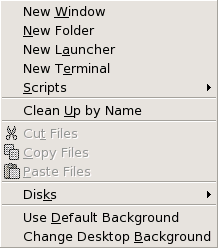
You can also right-click on the desktop to open the Desktop menu.
The conventions used in this manual to describe actions
that you take with the mouse are as follows:
As you use the mouse, the appearance of the mouse pointer can change.
The appearance of the pointer can provide feedback about a particular operation,
location, or state. The following table lists and describes some of the mouse
pointers.
For almost every task that you can perform with
the mouse, you can use the keyboard to perform the same task. Shortcut keys are keys that provide you with a quick way to perform
a task.
You can use shortcut keys to perform desktop environment tasks and to
work with interface items such as panels and windows. You can also use shortcut
keys in applications. To customize your shortcut keys, use the Keyboard Shortcuts preference tool.
You can also modify your desktop environment preferences to use keyboard
accessibility features.
The following sections describe the shortcut keys that you can use.
Desktop Environment Shortcut Keys
Desktop environment shortcut keys enable you
to use the keyboard to perform desktop environment tasks. The following table
lists some desktop environment shortcut keys:
Window shortcut keys enable you to use the keyboard to perform window
tasks. The following table lists some window shortcut keys:
Panel shortcut keys enable you to use the keyboard to perform panel
tasks. The following table lists panel shortcut keys:
Application Shortcut Keys
Application shortcut keys enable you to perform application
tasks. You can use shortcut keys to perform application tasks more quickly
than if you use a mouse. The following table lists some application shortcut
keys:
A menubar is a bar at the top of a window that contains the menus for the
application. An access key is an underlined letter
in a menubar, menu, or dialog that you can use to perform an action. On a
menubar, the access key for each menu is underlined.
To open a menu, press Alt, then press the access key.
In the menu, the access key for each menu item is underlined. To choose a
menu item, press the access key for the menu item. The following table shows
example access keys from the Text Editor application:
You can also use access keys to access elements in a dialog. In a dialog,
one letter in most dialog elements is underlined. To access a particular dialog
element, press Alt, then press the access key. The following
table shows an example access key from the Preferences
dialog in the Text Editor application:
You can use also other keys to navigate within a window or dialog.
This section provides information on how to use windows.
Some windows contain more than one pane.
A pane is a subdivision of a window. For example, the Nautilus file manager window contains a side pane and a
view pane. A window that contains panes has a resize handle on the edge between
the panes. To resize the pane, grab the resize handle, then drag the edge
to the size you require.
Some windows contain information that is organized in a table. This
section describes how to work with tables.
To change the width of a column, drag one of the vertical edges of the
column.
In some tables, you can sort the information by a particular column.
To sort information in a table, click on the heading on top of the column
by which you want to sort the information. An up arrow is displayed in the
column heading by which the table is sorted. The following figure shows the
up arrow.
To reverse the sort order, click on the column heading again. The up
arrow changes to a down arrow. The down arrow indicates that the information
in the column is sorted in reverse order.
In some tables, you can select multiple items. The following table describes
how to select items in tables.
Chapter 2. Overview of the GNOME Desktop
This chapter introduces you to the features and main components
of the GNOME Desktop. Before you start to use the desktop environment read
this chapter to familiarize yourself with the various features, and how the
main components work. The desktop environment is very configurable, so this
chapter describes the typical default configuration, covering the following
topics.
Introducing Desktop Environment Components
When you start a desktop environment session for the first
time, you should see a default startup screen, with panels, windows, and various
icons. Figure 2.1 shows a typical desktop environment.
The major components of the desktop environment are as follows:
Panels
Panels are areas in your desktop environment from which you can access
all of your system applications and menus. Panels are very configurable. A
particularly important panel in Figure 2.1 is the
top edge panel. The top edge panel includes the Menu Bar.
The Menu Bar contains two special menus, as follows:
Applications menu: Contains all applications
and configuration tools. This menu also includes the file manager and the
help browser. To start the file manager, choose Home Folder
from the Applications menu.
Actions menu: Contains various commands
that perform desktop environment functions, for example Search
for Files and Log Out.
Click on the icon at the extreme right of the top edge panel to display
a list of all open windows.
Menus
You can access all desktop environment functions through menus. The
top edge panel contains menus, so you can use a combination of menus and panels
to perform your tasks. You can use the Applications menu
and the Actions menu to access almost all of the standard
applications, commands, and configuration options.
You can also access almost all of the standard applications, commands,
and configuration options from the Main Menu. You can access
the items in the Applications and Actions
menus from the Main Menu. You can add the Main
Menu as a button to your panels.
Windows
You can display many windows at the same time. You can run different
applications in each window. The window manager provides frames and buttons
for windows. The window manager enables you to perform standard actions such
as move, close, and resize windows.
Workspaces
You can subdivide your desktop environment into separate workspaces. A workspace is a discrete area in which you can work.
You can specify the number of workspaces in your desktop environment. You
can switch to a different workspace, but you can only display one workspace
at a time.
Nautilus file manager
The Nautilus file manager provides an integrated
access point to your files and applications. You can display the contents
of your files within a file manager window, or open the files in the appropriate
application from the file manager. You can use the file manager to manage
your files and folders.
Desktop
The desktop is behind all of the other components on the desktop. The
desktop is an active component of the user interface. You can place objects
on the desktop to quickly access your files and directories, or to start
applications that you use often. You can also right-click on the desktop to
open a menu.
Start Here location
The Start Here location provides an access point
to some of the key features of the desktop environment. You can access your
GNOME applications and configuration tools from the Start Here
location. You can also access programs that enable you to configure your system
as a server, and to choose other system settings.
Desktop environment preferences
The desktop environment contains dedicated preference tools. Each tool controls a particular part of the behavior of the
desktop environment. To start a preference tool, choose Applications->Desktop Preferences. Choose the item that you want to configure from the submenus.
The most powerful features of the desktop environment are the high degree
of configurability and the multiple ways that you can perform tasks.
The desktop environment provides interoperability of the desktop environment
components. Usually, you can perform the same action in several different
ways. For example, you can start applications from panels, from menus, or
from the desktop.
Your system administrator can make configuration changes to suit your
needs, so that the desktop environment might not be exactly the same as described
in this chapter. Nevertheless, this chapter provides a useful quick guide
to how to work with the desktop environment.
You can add or delete panels at any time. When you start a session for
the first time, the desktop environment usually contains a panel at the top
edge of the screen, and a panel at the bottom edge of the screen.
You can perform the following actions with panels:
To add a panel, right-click on a vacant space on any panel, then choose New Panel. The new panel is added to your desktop environment.
The new panel contains no objects. You can customize the new panel to suit
your preferences. You can add objects to the panel to fit your own requirements.
You can also change the background of the panel. You can create as many panels
as you want.
To delete a panel, right-click on the panel then choose Delete This Panel.
Panels can have hide buttons at each end of the panel. You click on
the hide buttons to hide or show the panel.
A panel can hold several types of objects. The panel in Figure 2.2
contains each type of panel object.
You can add any of the following objects to all types of panels:
Applets
Applets are small, interactive applications that
reside within a panel, for example CD Player in Figure 2.2. Each applet has a simple user interface that
you can operate with the mouse or keyboard. The following applets appear in
your panels by default:
Menu Bar: Provides access to the Applications menu and the Actions menu. You can
use the menus to access your applications, preference tools, and other desktop
environment tasks.
Window List: Displays a button
for each window that is open. You can click on a window list button to minimize
and restore windows. By default, Window List appears
in the edge panel at the bottom of the screen.
Workspace Switcher: Displays a
visual representation of your workspaces. You can use Workspace
Switcher to switch between workspaces. By default, Workspace Switcher appears in the edge panel at the bottom of
the screen.
To add an applet to a panel, right-click on a vacant space on the panel,
then choose Add to Panel. Choose the applet that
you require from one of the following submenus:
Accessories
Amusements
Internet
Multimedia
Utility
Launchers
A launcher starts a particular application, executes
a command, or opens a file. The calculator icon in Figure 2.2
is a launcher for the Calculator application. A
launcher can reside in a panel or in a menu. Click on the launcher to perform
the action that is associated with the launcher.
You can create your own launchers for applications. For example, you
can create a launcher for a word processor application that you use frequently,
and place the launcher in a panel for convenient access. To add a new launcher
to a panel, right-click on a vacant space on the panel, then choose Add to Panel->Launcher.
Alternatively, to add a launcher from a menu, right-click on a vacant
space on the panel, then choose Add to Panel->Launcher from menu. Choose
the launcher to add from the submenus.
Buttons
You can add buttons to your panels to provide quick access to common
functions. You can add the following buttons to your panels:
Force Quit: Use this button to terminate
applications that do not respond to your commands.
Lock: Click on this button to lock
your screen. The lock icon in Figure 2.2 is the Lock button.
Log Out: Click on this button to end
your session
Run: Click on this button to open the Run Application dialog, from which you can run commands.
Screenshot: Click on this button to
take a screenshot of the screen.
Search: Click on this button to open
the Search Tool application, from which you can
search for files.
Show Desktop: Click on this button
to minimize all windows and show the desktop.
To add the buttons to a panel, right-click on a vacant space on the
panel, then choose Add to Panel->Actions. You can then choose the button you require.
Menus
You can access all desktop environment functions through menus. The
default panels contain menus, so you can use a combination of menus and panels
to perform your tasks. To open a menu from a panel, click on the icon that
represents the menu. To open a menu from the Menu Bar,
click on the text that represents the menu.
Menus that you add to your panels are represented by an icon with an
arrow. The arrow indicates that the icon represents a menu. The icon in Figure 2.2 is the icon that is displayed when you add the Desktop Preferences menu to a panel.
You can add the Main Menu to any of your panels.
To add the Main Menu to a panel, right-click on a vacant
space on the panel, then choose Add to Panel->Main Menu.
You can also add the Menu Bar to any of your
panels. To add the Menu Bar to a panel, right-click
on a vacant space on the panel, then choose Add to Panel->Menu Bar.
Drawers
Drawers are sliding extensions to a panel that
you can open or close from a drawer icon, as shown in Figure 2.2.
Drawers can help you to organize your work when you run a lot of applications
simultaneously. You can place all the same functional elements in a drawer
that you can put in any other type of panel.
To add a drawer to a panel, right-click on a vacant space on the panel,
then choose Add to Panel->Drawer.
To open a drawer click on the drawer. To close a drawer click on the
drawer again.
To Manipulate Panel Objects
You can manipulate panel objects in the following ways:
Move objects within a panel, or to another panel.
You can move any object to another location in the panel. You can also
move an object from one panel to another panel. Use the middle mouse button
to drag the panel object to the new location.
Copy menu items to a panel.
Drag the item from the menu to the panel. Alternatively, if the menu
item is a launcher right-click on the menu item, then choose Add this launcher to panel.
You can access all desktop environment functions through menus. Your
default panels contain menus, so you can use a combination of menus and panels
to perform your tasks. The top edge panel contains the Menu Bar. The Menu Bar contains Applications and Actions menus.
You can use the Applications menu and the Actions menu to access almost all of the standard applications,
commands, and configuration options. You can also access the items in the Applications and Actions menus from the Main Menu.
To add a Menu Bar to a panel, right-click
on the panel then choose Add to Panel->Menu Bar.
To add a Main Menu to a panel, right-click on the
panel then choose Add to Panel->Main Menu. The Main Menu is
represented by a stylized footprint, as follows:
Click on the Main Menu button on a panel to open
the Main Menu.
You can add as many additional menus as you want to any of your panels.
To open a menu that you add to a panel, click on the menu icon on the panel.
You can perform other actions on your menus, such as copy menu items to panels.
You can display many windows at the same time in your desktop environment.
Each window has a frame. The window frame contains active control elements
that you can use to work with the window.
The desktop environment features the following types of window:
Application windows
When you run an application, a frame usually borders the window. The
top edge of the application window contains a titlebar. The titlebar contains
buttons that you can use to work with the window. The buttons in an application
window frame enable you to perform actions such as open the Window
Menu, or close the window. The Window Menu provides
commands that you can perform on the window.
Dialog windows
Dialog windows are associated with interactive processes. A dialog window
consists of the window frame, and a single interactive pane that provides
information and controls for the user. This manual refers to the interactive
part of a dialog window as a dialog. The frame of a dialog window contains
buttons that enable you to open the Window Menu, or to
close the dialog window.
You use the frame of an application window or dialog window to perform
various actions with the window. Most of the control elements are located
on the top edge of the window frame. Figure 2.3 shows
the top edge of a frame for a typical application window.
The active control elements of the window frame are as follows:
To change the size of windows grab the border of the window, but not
the titlebar. Drag the border until the window is the size that you require.
To Give Focus to a Window
A window that has focus can receive input from the mouse and the keyboard.
Only one window can have focus at a time. The window that has focus has a
different appearance than other windows.
You can use the following elements to give focus to a window:
You can display many windows at the same time in your desktop environment.
Your windows are displayed in subdivisions of your desktop environment that
are called workspaces. A workspace is a discrete area in which you can work.
Every workspace contains the same desktop, the same panels, and the
same menus. However, you can run different applications, and open different
windows in each workspace. You can display only one workspace at a time in
your desktop environment but you can have windows open in other workspaces.
Workspaces enable you to organize the desktop environment when you run
many applications at the same time. When your current workspace becomes crowded
with windows, you can move your work to another workspace. You can also switch
to another workspace then start more applications.
Workspaces are displayed in the Workspace Switcher
applet. In Figure 2.4, Workspace Switcher contains four workspaces. The first three workspaces contain
open windows. The last workspace does not contain currently active windows.
To Switch Between Workspaces
You can switch between workspaces in the following ways:
In Workspace Switcher, click on
the workspace where you want to work.
Press Ctrl-Alt-right arrow to switch to the workspace on the right of the current
workspace.
Press Ctrl-Alt-left arrow to switch to the workspace on the left of the current
workspace.
To add workspaces to your desktop environment, right-click
on the Workspace Switcher applet, then choose Preferences. The Workspace Switcher Preferences
dialog is displayed. Use the Number of workspaces spin
box to specify the number of workspaces that you require.
The Nautilus file
manager provides an integrated access point to your files, applications, FTP
sites, and URIs. To open a file manager window, choose Applications->Home Folder.
The following figure shows a file manager window that displays the contents
of a folder.
A file manager window contains the following panes:
- Side pane
Enables you to navigate
through your files. This pane also displays information about the current
file or folder. The side pane is on the left side of the window.
- View pane
Displays the contents
of files and folders. The view pane is on the right side of the window.
Nautilus enables you to do
the following:
View files and folders
You can view your files and folders as icons or as a list. You can view
the contents of some types of file within a file manager window. Alternatively,
you can open the files in the appropriate application from the file manager.
Manage your files and folders
You can use the file manager to create, move, copy, rename, and remove
files and folders.
Run scripts
You can run scripts from the file manager, and you can select files
and folders on which to run your scripts.
Customize your files and folders
You can add emblems to your files and folders to indicate particular
states. For example, you can add an Important emblem
to a file to indicate that the file is important. You can also customize folders
in the following ways:
Open special Uniform Resource Identifiers
(URIs)
The GNOME Desktop contains special URIs that enable you to access particular
functions from the file manager. For example, to access the preference tools,
you can access the preferences:/// URI in the file manager.
Write CDs
The file manager provides a special location where you can copy files
and folders that you want to write to a CD. You can write the contents of
the location to a CD easily.
The file manager also creates the desktop.
To Open Files From the File Manager
To navigate to the folder where the file that you want to open resides,
double-click on the folder icons in the view pane. When the file that you
want to open is displayed, double-click on the file icon to open the file.
To Move Files Between Folders
You can move files between folders by opening two or more file manager
windows. Open a different folder in each window, then drag the files from
one window to the other.
Desktop and Desktop Objects
The desktop is an active component of the desktop. You can use the desktop
to perform the following actions:
Start your applications, and open your files and folders.
You can add desktop objects for convenient access
to the files, folders, and applications that you use frequently. For example,
you add a launcher for an application that you use often.
Open the Desktop menu.
Right-click on the desktop to open the Desktop menu.
You can use the Desktop menu to perform actions on the
desktop.
The file manager manages the desktop.
To open an object from the desktop, double-click on the object. You
can set your preferences in a Nautilus window so
that you click once on an object to execute the default action.
To Add Objects to the Desktop
You can add desktop objects for convenient access to files, folders,
and applications that you use frequently. You can add objects to your desktop
in the following ways:
Use the Desktop menu to add a launcher
to the desktop.
Drag an object from a file manager window to the desktop.
For example, you can create a symbolic link to a file that you use often,
then drag the link to your desktop. The icon for the link is moved to the
desktop. To open the file, double-click on the icon. You can also drag files
and folders to the desktop.
Drag an application launcher from a menu to the desktop. For
example, you can open a menu that contains a launcher for an application that
you use often, then drag the launcher to your desktop.
The Start Here location enables you to access the following functions:
Applications
Double-click on Applications to access your key
GNOME applications. You can also access the Applications
menu through the Menu Bar and the Main
Menu.
Desktop Preferences
Double-click on Desktop Preferences to customize
your desktop environment.
Programs that enable you to configure your system as a server,
and to choose other system settings.
You can access the Start Here location in the following
ways:
From a file manager window
Choose Go->Start Here. The contents of the Start Here
location are displayed in the window.
From the desktop
Double-click on the Start Here object on the desktop.
The contents of the Start Here location are displayed
in a file manager window.
Desktop Environment Preferences
You can use desktop environment preference tools to configure
almost every feature of the desktop environment. Each tool controls a particular
part of the behavior of the desktop environment. For example, you can use
a preference tool to select a theme for your desktop environment. A theme is a group of coordinated settings that specify the visual
appearance of a part of your interface.
For convenience, the tools are grouped under the following headings:
Basic
Accessibility
Advanced
You can open your desktop environment preference tools in either of
the following ways:
Choose Applications->Desktop Preferences. Choose the item
that you require from the submenus.
Double-click on the Start Here object
on the desktop. A Nautilus window opens at the Start Here location. Double-click on the Desktop Preferences object in the Nautilus window to display
the preference tools. Double-click on the item that you require.
The applications that are provided with the GNOME Desktop
share several characteristics. For example, the applications have a consistent
look-and-feel. The applications share characteristics because the applications
use the same programming libraries. An application that uses the standard
GNOME programming libraries is called a GNOME-compliant application. For example, Nautilus and the gedit text editor are GNOME-compliant applications.
GNOME provides libraries in addition to the libraries provided by your
operating system. The libraries enable GNOME to run your existing applications
as well as GNOME-compliant applications. For example, if your operating system
is UNIX-based, you can run your current X11 applications and Motif applications
from the GNOME Desktop.
Some of the features of GNOME-compliant applications are as follows:
Consistent look-and-feel
GNOME-compliant applications have a consistent look-and-feel. GNOME-compliant
applications use the look-and-feel settings that you specify in the preference
tools. You can use the following tools to change the look-and-feel of your
GNOME-compliant applications:
Menubars, toolbars, and statusbars
Most GNOME-compliant applications have a menubar, a toolbar, and a statusbar.
The menubar always contains a File menu and a Help menu. The File menu always contains an Quit menu item, and the Help menu always
contains an About menu item.
A toolbar is a bar that appears under the menubar.
A toolbar contains buttons for the most commonly-used commands. A statusbar is a bar at the bottom of a window that provides information
about the current state of what you are viewing in the window. GNOME-compliant
applications might also contains other bars. For example, Nautilus contains a location bar.
Some of the bars in GNOME-compliant applications are detachable. That
is, the bar has a handle that you can grab then drag the bar to another location.
You can drag the bar to snap to another side of the window, or to another
part of the screen. For example, you can detach the menubar, toolbar, and
location bar in the file manager.
Default shortcut keys
GNOME-compliant applications use the same shortcut keys to perform the
same actions. For example, to quit a GNOME-compliant application, press Ctrl-Q. To undo an action in a GNOME-compliant
application, press Ctrl-Z.
Drag-and-drop
GNOME-compliant applications use the same protocol to implement drag-and-drop
operations. Therefore, GNOME-compliant applications provide consistent feedback
when you drag-and-drop items.
The use of the same protocol also enables GNOME-compliant applications
to interoperate in a sophisticated manner. For example, GNOME-compliant applications
recognize the format of the items that you drag. When you drag a HTML file
from a Nautilus window to a web browser, the file
is displayed in HTML format in the browser. However, when you drag the HTML
file to a text editor, the file is displayed in plain text format in the text
editor.
The desktop environment provides help if you want to find out more about
the following areas:
To Find Out More About Desktop Environment Topics
You can find out more about particular
desktop environment topics in the integrated Yelp
help system. To start the Yelp help system, choose Applications->Help.
To Find Out More About Applets
To find out more about a specific applet, right-click on the applet,
then choose Help.
To Find Out More About Applications
To find out more about a specific application, start the application,
then choose Help->Contents. Alternatively, start the application then press F1.
Chapter 3. GNOME Desktop Sessions
This chapter provides the information you need to start,
manage, and end a GNOME Desktop session.
A session occurs between the time that you log in to the desktop environment
and the time that you log out. The login screen is your gateway to the desktop
environment. The login screen provides fields for you to enter your username
and password. The login screen enables you to select login options, for example
you can select the language of your session.
You start a session when you log in. The session manager starts after
your username and password are authenticated. The session manager enables
you to manage the session. For example, you can save the state of your most
recent session and return to that session the next time that you log in. The
session manager saves and restores the following:
The appearance and behavior settings, for example fonts, colors,
and mouse settings.
The applications that you were running, for example file manager
and text editor windows. You cannot save and restore applications that the
session manager does not manage. For example, if you start the vi editor from the command line in a terminal window, session
manager cannot restore your editing session.
To log in to a session, perform the following steps:
On the login screen, click on the Session
icon. Choose the GNOME Desktop from the list of available desktop environments.
Enter your username in the Username field
on the login screen, then press Return.
Enter your password in the Password field
on the login screen, then press Return.
When you log in successfully, the session manager starts a session.
If this is the first time you log in, then the session manager starts a new
session. If you have logged in before, then the session manager restores your
previous session, if you saved your session settings when you logged out.
If you want to shut down or restart the system before you log in, click
on the System icon on the login screen. A dialog is displayed.
Select the option that you require, then click OK.
To Log in to a Session in a Different Language
To log in to
a session in a different language, perform the following actions.
On the login screen, click on the Language
icon. Choose the language you require from the list of available languages.
Enter your username in the Username field
on the login screen, then press Return.
Enter your password in the Password field
on the login screen, then press Return.
To lock the screen, perform
one of the following actions:
Choose Actions->Lock Screen.
If the Lock button is present on a
panel, click on the Lock button.
To add the Lock button to a panel, right-click
on the panel. Choose Add to Panel->Actions->Lock.
When you lock your screen, the screensaver starts. To unlock the screen,
move your mouse to display the locked screen dialog. Enter your username and
password in the locked screen dialog, then press Return.
For information on configuring your screensaver, see Using
the Basic Preference Tools.
Note
To lock your screen correctly, you must have a screensaver enabled.
To configure the session management of the desktop environment,
use the Sessions preference tool. The Sessions preference tool recognizes the following types of application:
Applications that are session-managed. When
you save the settings for your session, the session manager saves all of the
session-managed applications. If you log out, then log in again, the session
manager automatically starts the session-managed applications.
Applications that are not session-managed. When you save the
settings for your session, the session manager does not save any applications
that are not session-managed. If you log out, then log in again, the session
manager does not start non-session-managed applications. You must start the
application manually. Alternatively, you can use the Sessions preference tool to specify non-session-managed applications
that you want to automatically start.
Defining Session Behavior When You Log In and Log Out
To set how a session behaves when you log in
and log out, use Sessions preference tool. Make
the changes you require in the Session Options tabbed
section. For example, you can select to display a splash screen when you log
in.
To Use Startup Applications
You
can configure your sessions to start with applications that are not session-managed.
To configure non-session-managed startup applications, use the Sessions preference tool. Use the Startup Programs tabbed section to add, edit, and delete applications. If you save
your settings and log out, the next time that you log in, the startup applications
start automatically.
To Browse Applications in the Current Session
To browse the applications in the current session, use the Sessions preference tool. The Current Session
tabbed section lists the following:
All GNOME applications that are currently running, that can
connect to the session manager, and that can save the state of the application.
All preference tools that can connect to the session manager,
and that can save the state of the tool.
You can use the Current Session tabbed section
to perform a limited number of actions on the session properties of an application
or preference tool. For example, you can edit the startup order, and restart
style of any GNOME application or preference tool that is in the list.
To save your session settings, perform the following steps:
Configure your session to automatically save settings when
you end the session. To configure your session, use the Sessions preference tool. The Sessions preference
tool starts. Select the Automatically save changes to session
option on the Session Options tabbed section.
End your session.
If you do not select the Automatically save changes to session option, when you log out, a dialog asks if you want to save your
current settings. To save your settings, select the option, then continue
to log out.
To end your session, close all your currently active processes, then
perform one of the following actions:
Before you end a session, you might want to save your current settings
so that you can restore the session later. During the logout process, a dialog
asks if you want to save your current settings. In the Sessions preference tool, you can select an option to automatically
save your current settings.
Chapter 4. Working With Panels
The information in this chapter describes how to use panels.
A panel is an area in your desktop environment from which you can run
applications and applets, and perform other tasks. When you start a session
for the first time, the desktop environment contains at least one panel. Your
system administrator might have set your default panels according to your
local requirements, so you might see slightly different default panels.
You can change the behavior and appearance of your panels to suit your
requirements. You can also add or remove objects from your panels. You can
create multiple panels, and choose different properties, objects, and backgrounds
for each panel. You can also hide panels.
Typically, the GNOME Desktop contains a panel at the top edge of the
screen, and a panel at the bottom edge of the screen. The following sections
describe these panels.
Figure 4.1
shows the panel at the top edge of the screen. Your system administrator might
have set your default top edge panel according to your local requirements,
so you might see a slightly different top edge panel.
The typical top edge panel contains the following objects:
Figure 4.2
shows a typical bottom edge panel. Your system administrator might have set
your default bottom edge panel according to your local requirements, so you
might see a slightly different bottom edge panel.
The bottom edge panel contains the following
items:
Show Desktop button: Click on this
button to minimize all open windows and show the desktop.
Window List applet: Displays a
button for each window that is open. Window List
enables you to minimize and restore windows.
Workspace Switcher applet: Enables
you to navigate between your workspaces.
The following sections describe how to manage your panels.
To add a panel, right-click on a vacant space on any panel, then choose New Panel. The new panel is added to your desktop environment.
The new panel contains no objects. You can customize the new panel to suit
your preferences.
To interact with a panel, you must left-click, middle-click,
or right-click on a vacant space on the panel. You can also middle-click or
right-click on one of the hide buttons to select the panel, if the panel has
no vacant space. If the hide buttons are not visible on a panel, modify the
properties of the panel so that the hide buttons are visible.
You use the mouse buttons to interact with a panel in the following
ways:
- Middle-click
Enables you to grab
a panel, then drag the panel to a new location.
- Right-click
Opens the panel popup
menu.
You can move panels to different locations. To move a panel, middle-click
and hold on any vacant space on the panel, then drag the panel to the new
location.
You can hide or show panels. To hide a panel, use a hide button. If
the hide buttons are not visible on a panel, modify the panel properties so
that the hide buttons are visible.
Hide buttons are at either end of a panel. The hide buttons contain
an optional arrow icon. The following illustration shows hide buttons.
To hide a panel, click on one of the hide buttons. The panel reduces
in the direction of the arrow on the hide button. The hide button at the other
end of the panel remains visible.
To show a hidden panel again, click on the visible hide button. The
panel expands in the direction of the arrow on the hide button. Both hide
buttons are now visible.
You can set a panel to autohide. When you set autohide, the panel hides
automatically when the mouse is not pointing to the panel. The panel reappears
when you point to the part of the screen where the panel resides. To set your
panel to autohide, modify the properties of the panel.
To Modify Panel Properties
To modify preferences for all panels, use the Panel preference tool to make the changes that you require. For
example, you can specify various settings related to the appearance and behavior
of panel objects.
You can also modify properties for each individual panel. You can change
the features for each panel, such as the type of the panel, the hide behavior,
and the visual appearance.
To modify the properties of a panel perform the following steps:
Right-click on a vacant space on the panel, then choose Properties to display the Panel Properties
dialog. The Panel Properties dialog contains the following
tabbed sections:
To modify panel size, position, and hiding properties, click
on the General tab. The following table describes the
dialog elements on the General tabbed section:
To modify the panel background, click on the Background tab. The Background tabbed section contains
the following elements:
Choose the type of background for the panel. The choices are as follows:
You can also drag a color or image on to a panel to set the color or
image as the background of the panel. For more information, see the section called “To Drag a Color or Image to the Background of a Panel”.
Click Close to close the Panel Properties dialog.
To Drag a Color or Image to the Background of a Panel
You can drag a color or image on to a panel to set the color
or image as the background of the panel. You can drag a color or image from
many applications. For example, you can drag a color from the Nautilus file manager to a panel to set the color as the background
of the panel. You can also drag a color from any color selector dialog.
You can drag an image to a panel to set the image as the background
of the panel. You can also drag pattern images from the file manager to set
the background of the panel.
To delete a panel from your desktop environment, right-click on the
panel that you want to delete, then choose Delete
This Panel.
Note
You must always have at least one panel in your desktop environment.
If you have only one panel in your desktop environment, you cannot delete
that panel.
This section describes the objects that
you can add to your panels, and use from your panels.
Interacting With Panel Objects
You use the mouse buttons to interact with a panel object
in the following ways:
- Left-click
Launches the panel object.
- Middle-click
Enables you to grab
an object, then drag the object to a new location.
- Right-click
Opens the panel object
popup menu.
You interact with applet panel objects in a different
way. For more information, see the section called “To Select an Applet”.
To Add an Object to a Panel
You can add an object to a panel in several ways, as follows:
From the panel popup menu
Right-click on a vacant space on a panel to open the panel popup menu.
The panel popup menu contains an Add to Panel submenu.
The Add to Panel submenu enables you to add the following
objects to your panels:
Applets in the following categories: Accessory, Amusement, Internet, Multimedia, Utility.
Buttons for quick access to common actions: Force
Quit button, Lock button, Log
Out button, Run button, Screenshot button, Search button, Show
Desktop button.
Launchers
Launchers from menus
Main Menu
Menu Bar
Drawers
From any menu
When you right-click on a launcher in any menu, a popup menu for the
launcher opens. You can use this popup menu to add the launcher to a panel.
You can also drag menus, launchers, and applets from menus to panels.
From the file manager
Each launcher corresponds to a .desktop file. You
can drag the .desktop file on to your panels to add the
launcher to the panel.
To Modify the Properties of an Object
Some panel objects, such as launchers and drawers,
have a set of associated properties. The properties are different for each
type of object. The properties specify details such as the following:
The command that starts a launcher application.
The location of the source files for a menu.
The icon that represents the object.
To modify the properties of an object perform the following steps:
Right-click on the object to open the panel object popup
menu, as shown in Figure 4.3.
Choose Properties. Use the Properties dialog to modify the properties as required. The properties
in the Properties dialog depend on which object you select
in step 1.
Click OK to apply the changes, then
close the Properties dialog.
You can move panel objects within a panel, and from one panel to another
panel. You can also move objects between panels and drawers.
To move a panel object, middle-click and hold on the object and drag
the object to a new location. When you release the middle mouse button, the
object anchors at the new location.
Alternatively, you can use the panel object popup menu to move an object,
as follows:
Right-click on the object, then choose Move.
Point to the new location for the object, then click any mouse
button to anchor the object to the new location. This location can be on any
panel that is currently in your desktop environment.
Movement of a panel object affects the position of other objects on
the panel. To control how objects move on a panel, you can specify a movement
mode. To specify the movement mode, press one of the following keys as you
move the panel object:
You can lock panel objects so that the objects stay in the same position
on the panel. This feature is useful if you do not want some panel objects
to change position when you move other panel objects.
To lock an object to the current location of the object in the panel,
right-click on the object to open the panel object popup menu, then choose Lock. To unlock the object, right-click on the object, then
choose Unlock.
To remove an object from a panel right-click on the object
to open the panel object popup menu, then choose Remove From
Panel.
An applet is a small application whose
user interface resides within a panel. You use the applet panel object to
interact with the applet. For example, the following figure shows the following
applets, from left to right:
Window List: Displays the windows
currently open on your system.
CD Player: Enables you to control
the compact disc player on your system.
Volume Control: Enables you to
control the volume of the speaker on your system.
To Add an Applet to a Panel
You can add an applet to a panel from the panel popup menu.
Right-click on any vacant space on the panel to open the panel popup menu.
Choose Add to Panel, then choose the applet that you want
to add from one of the following submenus:
Accessories
Amusements
Internet
Multimedia
Utility
Alternatively, drag the applet from the submenu on to the panel.
To modify the properties of an applet, you must first right-click on
the applet to display the panel object popup menu. To move an applet, you
must middle-click on the applet.
Some restrictions apply on where you can click on an applet in order
to display the panel object popup menu, or to move the applet, as follows:
Some applets have popup menus of applet-specific commands
that open when you right-click on particular parts of the applet. For example,
the Window List applet has a vertical handle on
the left side, and buttons that represent your windows on the right side.
To open the panel object popup menu for the Window List
applet, you must right-click on the handle. If you right-click on a button
on the right side, a popup menu for the button opens.
Some applets have areas that you cannot use to select the
applet. For example, the Command Line applet has
a field in which you enter commands. You cannot middle-click or right-click
on this field to select the applet. Instead, middle-click or right-click on
another part of the applet.
To Modify Preferences for an Applet
To modify the preferences for an applet perform the following
steps:
Right-click on the applet, then choose Preferences. Use the Preferences dialog to modify
the preferences as required. The preferences for applets vary depending on
the applet.
Click Close to close the Preferences dialog.
When you click on a launcher, you initiate
one of the following actions:
Start a particular application.
Execute a command.
Open a folder in a file manager window.
Open a browser at a particular Uniform Resource
Locator (URL). A URL is the address of a particular location on
the Web.
Open special Uniform Resource Identifiers
(URIs). The GNOME Desktop contains special URIs that enable you to access
particular functions from the file manager.
You can find launchers in the following places in the desktop environment:
Panels: On panels, launchers are represented by icons.
Menus: On menus, launchers are represented by menu items.
The menu items usually have an icon beside the menu item.
Desktop: On the desktop, launchers are represented by icons.
You can modify the properties of a launcher. For example, the properties
of a launcher include the name of the launcher, the icon that represents the
launcher, and how the launcher runs.
To Add a Launcher to a Panel
You can add a launcher to a panel in one of the following
ways:
From the panel popup menu
To create a new launcher, right-click on any vacant space on the panel,
then choose Add to Panel->Launcher. A Create Launcher
dialog is displayed. For more information on how to complete this dialog,
see the section called “To Create a Launcher With the Create Launcher Dialog”.
Alternatively, to add an existing launcher to the panel, choose Add to Panel->Launcher from menu from the panel popup menu. Choose the launcher that you want
to add from the menu.
From any menu
To add a launcher to a panel from any menu, perform one of the following
steps:
Open a menu that contains the launcher. Drag the launcher
on to the panel.
Open the menu that contains the launcher from the panel where
you want the launcher to reside. Right-click on the title of the launcher.
Choose Add this launcher to panel.
From the file manager
To add a launcher to a panel from the file manager, find the .desktop file for the launcher in your file system. To add the
launcher drag the .desktop file to the panel.
To Create a Launcher With the Create Launcher Dialog
To create a launcher with the Create Launcher dialog
perform the following steps:
Right-click on any part of a panel to open the panel popup
menu. Choose Add to Panel->Launcher to display the Create Launcher dialog. The dialog displays the Basic tabbed
section.
Enter the properties of the launcher in the dialog. The following
table describes the dialog elements on the Basic tabbed
section:
To set advanced properties for the launcher, click on the Advanced tab. The Launcher Properties dialog
displays the Advanced tabbed section.
Enter the advanced properties of the launcher in the dialog.
The following table describes the dialog elements on the top part of the Advanced tabbed section:
You can also add a translation of the Name, Generic name, and Comment fields from the Basic tabbed section. To add a translation, enter the details of
the translation in the Name/Comment translations table
as follows:
Then click on the Add/Set button.
To edit a translation, select the translation. The translated text appears
in the lower part of this dialog. Edit the fields as required, then click
on the Add/Set button.
To remove a translation, select the translation, then click on the Remove button.
To create the launcher and close the Launcher Properties dialog, click OK.
The type of commands that you can enter in the Command
field depend on the option that you choose from the Type
drop-down combination box. If you choose Application
from the Type drop-down combination box, you can enter
a normal command. The following table shows some sample commands and the actions
that the commands perform:
If you choose Link from the Type
drop-down combination box, you can enter a link command. The following table
shows some sample link commands and the actions that the commands perform:
To Modify the Properties of a Launcher
To modify the properties of a launcher perform the following
steps:
You can add buttons to your panels to provide quick access
to common actions and functions.
The Force Quit button enables you to select a
window to terminate an application. This button is useful if you want to terminate
an application that does not respond to your commands.
To add a Force Quit button to a panel, right-click
on any vacant space on the panel. Choose Add to Panel->Actions->Force Quit. To terminate an application, click on the Force Quit button, then click on a window from the application
that you want to terminate. If you do not want to terminate an application
after you click on the Force Quit button, press Esc.
The Lock
button locks your screen and activates your screensaver. To access your session
again, you must enter your password. To lock your screen correctly, you must
have a screensaver enabled.
To add a Lock button to a panel, right-click
on any vacant space on the panel. Choose Add to Panel->Actions->Lock.
Right-click on the Lock button to open a menu
of screensaver-related commands. Table 4.1 describes
the commands that are available from the menu.
Table 4.1. Lock Screen Menu Items
Menu Item | Function |
|---|
Activate Screensaver
| Activates the screensaver immediately, but does
not lock the screen. |
Lock Screen
| Locks the screen immediately. This command performs
the same function as when you click on the Lock button. |
Kill Screensaver Daemon
| Terminates the screensaver process. After you terminate
the screensaver process, you cannot lock your screen. |
Restart Screensaver Daemon
| Terminates and restarts the screensaver process.
Use this command after you change your password. When you restart the screensaver
process, use your new password with the screensaver. |
Properties
| Displays the XScreenSaver preference
tool. |
The Log Out button begins the process to log out of
a GNOME session.
To add a Log Out button to a panel, right-click
on any vacant space on the panel. Choose Add to Panel->Actions->Log Out. To log out of your session or shut down your system, click
on the Log Out button.
You
can use the Run button to open the Run Application dialog.
To add a Run button to a panel, right-click on
any vacant space on the panel. Choose Add to Panel->Actions->Run. To open the Run Application dialog, click
on the Run button.
For more information on the Run Application dialog,
see Working With Menus.
You can use the Screenshot button to take a screenshot
of your screen.
To add a Screenshot button to a panel, right-click
on any vacant space on the panel. Choose Add to Panel->Actions->Screenshot. To take a screenshot of your screen, click on
the Screenshot button.
For more information on how to take screenshots, see Working
With Menus.
You can use the Search button to open the Search Tool.
To add a Search button to a panel, right-click
on any vacant space on the panel. Choose Add to Panel->Actions->Search. To open the Search Tool, click on
the Search button.
For more information on the Search Tool,
see the Search Tool Manual.
You can use the Show Desktop button to minimize
all open windows and show the desktop.
To add a Show Desktop button to a panel, right-click
on any vacant space on the panel. Choose Add to Panel->Actions->Show Desktop. To minimize all windows and show the desktop,
click on the Show Desktop button.
The Notification Area applet displays icons
from various applications to indicate activity in the application. For example,
when you use the CD Player application to play
a CD, a CD icon is displayed in the Notification Area
applet. The graphic above illustrates the CD icon in the Notification
Area applet.
To add a Notification Area applet to a panel,
right-click on any vacant space on the panel. Choose Add to Panel->Utility->Notification Area.
You can add the following types of menu to your panels:
Main Menu: You can access almost all of
the standard applications, commands, and configuration options from the Main Menu. To add a Main Menu to a panel, right-click
on any vacant space on the panel, then choose Add to
Panel->Main Menu.
You can add as many Main Menu objects to your panels as
you want. By default, the Main Menu is represented on panels
by a stylized footprint icon, as follows:
Menu Bar: You can access almost
all of the standard applications, commands, and configuration options from
the menus in the Menu Bar. The Menu
Bar contains the Applications menu and the Actions menu. To add a Menu Bar to a
panel, right-click on any vacant space on the panel, then choose Add to Panel->Menu Bar. You can add as many Menu Bar objects
to your panels as you want.
System menus: System menus contain the standard applications
and tools that you can use in your desktop environment. The Applications menu and Actions menu are system menus. To add
a system menu to a panel, right-click on a launcher in the menu, then choose Entire menu->Add this as menu to panel.
Menus that you add to your panels are represented by an icon with an
arrow. The arrow indicates that the icon represents a menu or drawer. Figure 4.4 shows how menus typically appear on panels.
A drawer is an extension of a panel. You
can open and close a drawer in the same way that you can show and hide a panel.
A drawer can contain all panel objects, including launchers, menus, applets,
other panel objects, and other drawers. When you open a drawer, you can use
the objects in the same way that you use objects on a panel.
The following figure shows an open drawer that contains two panel objects.
The arrow on the drawer icon indicates that the icon represents a drawer
or menu.
You can add, move, and remove objects from drawers in the same way that
you add, move, and remove objects from panels.
To Open and Close a Drawer
To open a drawer, click on the drawer object in a panel. You can close
a drawer in the following ways:
To Add a Drawer to a Panel
You can add a drawer to a panel in the following ways:
From the panel popup menu
Right-click on any vacant space on the panel, then choose Add to Panel->Drawer.
From any menu
You can add a menu as a drawer object to a panel.
To add a menu as a drawer to a panel, open the menu from the panel.
Right-click on any launcher in the menu, then choose Entire menu->Add this as drawer to panel.
To Modify Drawer Properties
To modify preferences for all panels and drawers, use the Panel preference tool. For example, you can select various options
related to the appearance and behavior of objects on panels and drawers. You
can also select options that relate to drawers only. For example, you can
select an option to close your drawers when you click on a launcher in the
drawer.
You can also modify other properties for each individual drawer. You
can change features for each drawer, such as the visual appearance of the
drawer and whether the drawer has hide buttons.
To modify properties for a drawer perform the following steps:
Right-click on the drawer, then choose Properties to display the Panel Properties dialog.
The dialog displays the General tabbed section.
Select the properties for the drawer in the dialog. The following
table describes the elements on the General tabbed section:
You can use the Background tabbed section
to set the background for the drawer. For information on how to complete the Background tabbed section, see the step on this topic in the section called “To Modify Panel Properties”. You can also drag a color or image on to a drawer
to set the color or image as the background of the drawer. For more information,
see the section called “To Drag a Color or Image to the Background of a Panel”.
Click Close to close the Panel Properties dialog.
Chapter 5. Working With Menus
This chapter describes how to use menus in the GNOME Desktop.
You can access all desktop environment functions through menus. The
panels contains menus, so you can use a combination of menus and panels to
perform your tasks. You can perform various actions on your menus, such as
copy menu items to panels.
You can access the following menus in your desktop environment:
Applications menu: You can access many
of your applications, commands, and configuration options from the Applications menu. You can also access the desktop environment preference
tools from the Applications menu.
Actions menu: You can access various commands
that enable you to perform desktop environment tasks from the Actions menu. For example, you can start the Search Tool
application, or log out of the desktop environment.
Main Menu: You can access the items in
the Applications and Actions menus from
the Main Menu. You can have many Main Menu
buttons in your panels.
Menu Bar: You can also access the
items in the Applications and Actions
menus from the Menu Bar. You can have many Menu Bar objects in your panels.
You can also right-click on the desktop to open the Desktop menu. The Desktop menu enables you to perform
desktop-related tasks.
All of these menus provide you with multiple ways to perform your tasks,
and enable you to work in the way that you prefer.
Menus can contain the following items:
Submenus
Launchers or menu items
An arrow to the right of an item in a menu indicates that the item is
a submenu. When you point to the submenu, the submenu opens. You can choose
items from the submenu.
When you choose a launcher, the launcher starts an application or runs
a command. You can also right-click on a launcher to open a popup menu. The
popup menu enables you to add the item to a panel, and perform other tasks.
For more information on the popup menu, see the next section.
You can change the theme for your session to change how all your menus
look. To change the theme, use the Theme preference
tool.
Items in menus have an associated
popup menu that enables you to perform tasks related to the item. When you
right-click on an item in a menu, the popup menu for the item opens. The popup
menu also contains a submenu that allows you to perform menu-related tasks.
You can use the menu item popup menu to perform the following tasks:
Add menu items as launchers to panels.
Remove items from menus.
Open the Run Application dialog with
the menu item command in the dialog.
Add menus to panels. You can add a menu as a menu object or
as a drawer object.
Add new items to menus.
Change the properties of submenus and menu items.
Figure 5.1 shows the popup menu.
Table 5.1 describes menu item popup menus.
Table 5.1. Menu Item Popup Menus
Item | Description |
|---|
Add this launcher to panel
| Adds the launcher to the panel from which you open
the menu. |
Remove this item
| Removes the launcher from the menu. |
Put into run dialog
| Displays the Run Application
dialog with the command from the Command field of the
launcher in the command field on the Run Application
dialog. |
Help on application-name
| Opens the online help for the application. |
Properties
| Displays a dialog that enables you to edit
the properties of the launcher. |
Entire
menu->Add this as drawer to panel
| Adds the submenu as a drawer to the panel from which you open the menu. |
Entire
menu->Add this as menu to panel
| Adds the submenu as a menu object to the panel from which you open the menu. |
Entire menu->Add new item to this menu
| Enables you to add an item to the submenu. |
Entire menu->Properties
| Displays a dialog that enables you to edit
the properties of the submenu. |
The Applications menu contains a hierarchy
of submenus, from which you can start the standard GNOME applications and
preference tools. The Applications menu contains the Desktop Preferences menu. You can use the Desktop Preferences menu to start the desktop environment preference tools. The Applications menu also includes the file manager and the help browser.
The Applications menu resides in the following places:
The Actions menu contains various commands that enable
you to perform desktop environment tasks. Table 5.2
describes the commands in the Actions menu.
Table 5.2. Actions Menu Commands
Menu Item | Function |
|---|
Run Application
| Opens the Run Application dialog.
Use the Run Application dialog to run commands. For more
information, see the section called “Using the Run Application Dialog”. |
Search for Files
| Starts the Search Tool
application. For more information, see the Search Tool
manual. |
Open Recent
| Displays a submenu of the last ten files which
you saved. |
Take Screenshot
| Takes a screenshot of the screen, and opens the Save Screenshot dialog. Use the Save Screenshot
dialog to save the screenshot. |
Lock Screen
| Locks your screen. |
Log Out
| Logs you out of the current session. |
The Actions menu resides in the following places:
Using the Run Application Dialog
The Run Application dialog gives you access to the command
line. When you run a command in the Run Application dialog,
you cannot receive output from the command.
To run a command from the command line perform the following steps:
Display the Run Application dialog. You
can display the Run Application dialog in any of the
following ways:
From any panel
Add the Run button to a panel. Right-click on
the panel, then choose Add to Panel->Actions->Run.
Click on the Run button.
From the Main Menu
Open the Main Menu, then choose Run
Application.
From the Menu Bar
Choose Actions->Run
Application.
Use shortcut keys
The default shortcut keys to display the Run Application
dialog are Alt-F2. You can change the
shortcut keys that display the Run Application dialog
in the Keyboard Shortcuts preference tool.
From a menu item popup menu
Right-click on an item in a menu, then choose Put into run
dialog from the popup menu. The Run Application
dialog opens with the command from the menu in the command field.
The Run Application dialog is displayed.
Enter the command that you want to run in the blank field.
Alternatively, to choose a command that you ran previously, click the down
arrow button beside the command field, then choose the command to run.
Alternatively, select the Show list of known applications option to display a list of available applications.
You can also use the Run with file button to
choose a file to append to the command line. For example, you can enter emacs as the command, then choose a file to edit.
Select the Run in terminal option to run the application
or command in a terminal window. Choose this option for an application or
command that does not create a window in which to run.
Click on the Run button on the Run Application dialog.
You can
take a screenshot in any of the following ways:
From the Menu Bar
To take a screenshot of the entire screen, choose Actions->Take Screenshot.
A Save Screenshot dialog is displayed. To save the screenshot,
select the Save screenshot to file option. Enter the
path and filename for the screenshot in the drop-down combination box. Alternatively,
to save the screenshot to another directory, click Browse.
When you select a directory, click OK.
You can also save the screenshot to the desktop. To save the screenshot
to the desktop, select the Save screenshot to desktop
option.
From any panel
Add the Screenshot button to a panel. Right-click
on the panel, then choose Add to Panel->Actions->Screenshot. Click on the Screenshot button to take
a screenshot of the entire screen. Use the Save Screenshot
dialog to save the screenshot.
Use shortcut keys
To take a screenshot, use the following shortcut keys:
You can use the Keyboard Shortcuts preference
tool to modify the default shortcut keys.
Use a command
You can use the gnome-panel-screenshot command to
take a screenshot. The gnome-panel-screenshot command takes
a screenshot of the entire screen, and displays the Save Screenshot dialog. Use the Save Screenshot dialog to
save the screenshot.
You can also use options on the gnome-panel-screenshot
command as follows:
The Main Menu provides access to the Applications menu and the many of the items in the Actions
menu. You can access almost all of the standard applications, commands, and
configuration options from the Main Menu.
You can add Main Menu buttons to your panels. By
default, the Main Menu is represented on panels by a stylized
footprint icon, as illustrated in the graphic above.
You can open the Main Menu in the following ways:
From a panel with a Main Menu
Click on the Main Menu.
Use shortcut keys
You can use shortcut keys to open the Main Menu.
When you use shortcut keys to open the Main Menu, the Main Menu appears at the mouse pointer.
The default shortcut keys to open the Main Menu are Alt-F1. To change the shortcut keys that open
the Main Menu, use the Keyboard Shortcuts preference tool.
To Add a Main Menu to a Panel
You can add as many Main Menu buttons
as you want to your panels. To add a Main Menu to a panel,
right-click on any vacant space on the panel. Choose Add to Panel->Main Menu.
The Menu Bar provides access to the Applications and Actions menus. You can access
almost all of the standard applications, commands, and configuration options
from the Menu Bar.
To Add a Menu Bar to a Panel
You can add as many Menu Bar
applets as you want to your panels. To add a Menu Bar
to a panel, right-click on any vacant space on the panel. Choose Add to Panel->Menu Bar.
You can modify the contents of the following menus:
Applications menu
Desktop Preferences menu
You use the following desktop environment components to customize menus:
Menus on panels
Nautilus file manager
When you use panels to customize your menus, you use the menu item popup
menu. For more information, see the section called “Menu Item Popup Menu”.
When you use the file manager to customize your menus, you must access
the Applications menu or the Desktop Preferences menu from within the file manager. To access the Applications menu or the Desktop Preferences menu, open a
file manager window. Choose Go->Start Here. Double-click on the Applications object or on the Desktop Preferences object.
For more information on the file manager, see Nautilus File Manager.
To add a menu, perform the following steps:
In a file manager window, access the location where you want
to add the menu. For example, to add a menu to the Applications
menu, choose Go->Start Here, then double-click on the Applications object.
Choose File->New Folder. An untitled folder is added to the
view pane. The name of the folder is selected.
Type a name for the folder, then press Return.
The next time that you log out then log in again, the menu is in the
assigned location.
To Add a Launcher to a Menu
To add a launcher to a menu, perform the following steps:
Right-click on any item in the menu to which you want to add
the launcher.
Choose Entire menu->Add new item to this menu. A Create Launcher dialog is displayed.
Enter the properties of the launcher in the Create
Launcher dialog. For more information on the elements in the Create Launcher dialog, see Working With Panels.
Click OK.
To Add a Launcher to an Empty Menu
To add a launcher to an empty menu, perform the following steps:
Open a file manager window, then choose Go->Start Here. Alternatively,
double-click on the Start Here object on the desktop.
The Start Here location is displayed.
In the file manager window, double-click on the object that
represents the menu to which you want to add the launcher.
Choose File->New Launcher. A Create Launcher
dialog is displayed.
Enter the properties of the launcher in the Create
Launcher dialog. For more information on the elements in the Create Launcher dialog, see Working With Panels.
Click OK.
To Copy a Launcher to a Menu
To copy an existing launcher to a menu, perform the following
steps:
In a file manager window, access the location from which you
want to copy the launcher. For example, to copy a launcher from the Applications menu, choose Go->Start Here, then double-click on the Applications object.
Select the launcher that you want to copy, then choose Edit->Copy File.
In a file manager window, access the location to which you
want to copy the launcher.
Choose Edit->Paste Files. The launcher is added to the new location.
Alternatively, you can drag the launcher from one location to another.
The next time that you log out then log in again, the launcher is in
the new menu location.
To Edit the Properties of a Menu
To edit the properties of a menu, perform the following
steps:
Right-click on any item in the menu that you want to edit.
Choose Entire menu->Properties. A Launcher Properties dialog is displayed.
Modify the properties of the menu in the Launcher
Properties dialog. For more information on the elements in the Launcher Properties dialog, see Working With Panels.
Click OK.
To edit a menu item, perform the following steps:
Right-click on the item that you want to edit.
Choose Properties. A Launcher Properties dialog is displayed.
Modify the properties of the launcher in the Launcher
Properties dialog. For more information on the elements in the Launcher Properties dialog, see Working With Panels.
Click OK.
To Delete an Item from a Menu
To delete an item from a menu, use the menu item popup menu.
To delete an item from a menu, perform the following steps:
Right-click on the item that you want to delete.
Choose Remove this item.
Chapter 6. Working With Windows
The information in this chapter describes how to use windows
in the desktop environment. You can use several types of window manager with
the GNOME Desktop, for example, Metacity and Sawfish. Many of the functions in Metacity
are also available in Sawfish. This chapter describes
the functions that are associated with the Metacity
window manager.
You can display many windows at the same time in your desktop
environment. Your windows are displayed in subdivisions of your desktop environment
that are called workspaces. A workspace is a discrete area in which you can
work. Every workspace in your desktop environment contains the same desktop,
the same panels, and the same menus. However, you can run different applications,
and open different windows in each workspace. You can display only one workspace
at a time in your desktop environment but you can have windows open in other
workspaces.
The Workspace Switcher applet displays a
visual representation of your windows and workspaces, as show in Figure 6.1.
You can add workspaces at any time. To add workspaces to your desktop
environment, right-click on the Workspace Switcher
applet, then choose Preferences. The Workspace Switcher Preferences dialog is displayed. Use the Number of workspaces spin box to specify the number of workspaces
you require.
A window manager controls how windows appear and behave.
The window manager manages where your windows are located, and which window
has focus. The window frame contains buttons that enable you to perform standard
actions such as moving, closing, and resizing windows.
You can configure some window manager settings in the Windows preference tool. This manual describes the functions
that are associated with the default configuration of the Metacity window manager. The default configuration is specified in the Windows preference tool.
The desktop environment features the following types of windows:
Application windows
When you start an application, an application window opens. The window
manager applies a frame to the application window. By default, the top edge
of the application window contains a titlebar. The titlebar contains buttons
that you can use to work with the window. The buttons in an application window
frame enable you to perform actions such as open the Window Menu, or close the window. The Window Menu provides
a number of actions that you can perform on the window.
The following figure shows a typical application window.
Dialog windows
A dialog window is a popup window in which you enter information or
commands. The dialog appears within a window frame.
You can use the top edge of the frame to work with the window. For example,
you can use the titlebar to move the dialog. The frame also contains buttons
that enable you to do the following:
Open the Window Menu
Close the dialog window
Typically, you open a dialog window from an application window. When
you open a dialog window, the window is usually raised and has focus. Some
dialog windows do not allow you to use the application until you close the
dialog.
The following figure shows a typical dialog window.
A window frame is a border around a window. The window frame contains
a titlebar. The titlebar contains buttons that you can use to work with the
window.
You can apply several themes to your window frames. The theme determines
how the frame looks. To choose a theme for all your window frames, choose Applications->Desktop Preferences->Theme.
You can use the window frame to perform various actions
with the window. In particular, the titlebar contains various buttons. The
following figure shows the titlebar of an application window:
Dialog windows also contain some of the window frame control elements. Table 6.1 describes the active control elements on window
frames, from left to right.
Table 6.1. Window Frame Control Elements
Control Element | Description |
|---|
Window Menu
button | Click on
the button to open the Window Menu. |
Titlebar | You can use the titlebar to perform the following actions: To give focus to the window click on the titlebar. To move the window grab the titlebar and drag the window to
the new location. To shade the window, double-click on the titlebar. To unshade
the window, double-click on the titlebar again.
|
Minimize button | Click on the Minimize button
to minimize the window. |
Maximize button | Click on the Maximize button
to maximize the window. |
Close Window button | Click on the Close
Window button to close the window. |
Border | The border around the window. Use the border to perform the following actions: To resize the window grab the border and drag the border to
the new size. To open the Window Menu, right-click on
the border.
|
Window contents | The area inside the window frame. Use the
window contents to perform the following actions: To move a window, press-and-hold Alt, click
in the window contents, then drag the window to the new location. To resize a window, press-and-hold Alt,
then middle-click near the corner you want to resize. To resize the window,
drag from the corner on which you middle-clicked. To open the Window Menu, press-and-hold Alt, then right-click in the window contents.
|
Menus and Applets for Working With Windows and Workspaces
This section describes the menus and applets
that you can use to work with windows and workspaces.
The Window Menu is a menu of commands that you can
use to perform actions on your windows. To open the Window Menu
perform one of the following actions:
Click on the Window Menu button on
the window that you want to work with.
Press Alt-spacebar.
Press-and-hold Alt, then right-click on any
part of the window that you want to work with.
Table 6.2 describes the commands and submenus
in the Window Menu.
Table 6.2. Window Menu Commands and Submenus
Menu Item | Function |
|---|
Minimize
| Minimizes the window. |
Maximize or Unmaximize | Maximizes
the window. If the window is already maximized, choose Unmaximize to restore the window to its previous size. |
Roll Up or Unroll | Reduces a window
so that only the titlebar is visible. If the window is already rolled up,
choose Unroll to restore the window to its previous
size. |
Move
| Enables you to use the arrow
keys to move the window. |
Resize
| Enables you to use the arrow
keys to resize the window. |
Close
| Closes the window. |
Put on All
Workspaces or Only on This Workspace | Puts the window on all of your
workspaces. If the window is already on all of your workspaces, choose Only on This Workspace to put the window on the current workspace
only. |
Move to workspace-name or Only on workspace-name | Moves the window to the workspace that you choose. If
the window is on all of your workspaces, choose Only on workspace-name to put the window on the workspace
that you want. |
Window List displays a button for each application
window that is open. You can use the Window List
to perform the following tasks:
To minimize a window
Click on the button that represents the window.
To restore a minimized window
Click on the button that represents the window.
To give focus to a window
Click on the button that represents the window.
When you open an application window, Window List
displays a button that represents the window. The window list buttons show
which application windows are open. You can view which windows are open even
if some windows are minimized, or other windows overlap a window. Window List can display buttons for the windows in your current
workspace, or in all workspaces. To select this option, you must change the
preferences of Window List.
You can also right-click on a window list button to open the Window Menu for the window that the button represents. When you
open the Window Menu from Window List,
the Window Menu does not contain the workspace commands.
For more information on the Window Menu commands, see the section called “Window Menu”.
Figure 6.2 shows Window List
when the following windows are open:
gedit
Dictionary
GHex
GNOME Terminal
The buttons in the applet show the status of your windows. Table 6.3
explains the information that the window list buttons provide about the window.
The examples in Table 6.3 refer to Figure 6.2.
Table 6.3. Window Status Information on Window List Buttons
State | Indicates | Example |
|---|
Button is pressed in. | The window has focus. |
gedit
|
Square brackets around window title. | The window is minimized. |
[Dictionary]
|
Button is not pressed in, no square brackets
around title. | The window is displayed,
and is not minimized. |
ghex
|
Numeral on button, in parentheses. | The button represents
a group of buttons. |
Gnome-terminal (3)
|
Window List can group
the buttons that represent windows in the same class under one window list
button. The Gnome-terminal button in Figure 6.2
is an example of a button that represents a group of buttons. The following
figure shows an example of Window List with a button
group open:
To open a list of the windows in a group, click on the window list button
that represents the group. You can click on the items in the list to give
focus to windows, minimize windows, and restore windows.
To open the Window Menu for a window in a button
group, right-click on the window list button that represents the group. A
list of the windows in the group is displayed. To open the Window
Menu for a window in the group, click on the item in the list. When
you open the Window Menu from the Window List, the Window Menu does not contain the workspace
commands. For more information on the Window Menu commands,
see the section called “Window Menu”.
Workspace Switcher Applet
Workspace Switcher
displays a visual representation of your workspaces, as shown in Figure 6.3. Figure 6.3 shows the applet when the GNOME session contains
four workspaces. Your workspaces appear as buttons on the applet. The background
of the button in the applet that represents the current workspace is highlighted.
The current workspace in Figure 6.3 is the workspace
at the left of the applet. To switch to another workspace, click on the workspace
in the applet.
Workspace Switcher also displays the application
windows and dialogs that are open in your workspaces.
The applet displays the workspaces in order from left to right across
the rows of the applet. In Figure 6.3, the applet
is set up to display the workspaces in one row. You can specify the number
of rows in which your workspaces are displayed in Workspace Switcher. You can also change the default behavior of the applet to
display the names of your workspaces in the applet.
Using the Top Edge Panel to Work With Windows
From the top edge panel, you can view a
list of all windows that are currently open. You can also choose a window
to give focus to. To view the window list, click on the icon at the extreme
right of the top edge panel. The following figure shows an example of the
window list that is displayed from the top edge panel:
When the focus changes, the icon that you click on to display the window
list changes. The icon represents the window that currently has focus. To
give focus to a window, choose that window from the window list.
The window list lists the windows in all workspaces. The windows in
all workspaces other than the current workspace, are listed under a separator
line.
This section describes how to manipulate windows.
To Give Focus to a Window
A window that has focus can receive input from the mouse and the keyboard.
Only one window can have focus at a time. The window that has focus has a
different appearance than other windows.
You can use the following elements to give focus to a window:
To minimize a window perform one of the following actions:
Click on the Minimize button on the
window frame.
Open the Window Menu, then choose Minimize.
If the window has focus, click on the button that represents
the window in Window List. If the window does not
have focus, click twice on the button that represents the window.
Right-click on the button that represents the window in Window List, then choose Minimize
from the popup menu.
When you
maximize a window, the window expands as much as possible. To maximize a window
perform one of the following actions:
To maximize the window, click on the Maximize
button on the window frame. Alternatively, open the Window Menu,
then choose Maximize.
Right-click on the button that represents the window in Window List, then choose Maximize
from the Window Menu.
To restore a maximized window perform one of the following actions:
Click on the Maximize button on the
window frame.
Open the Window Menu. Choose Unmaximize.
Right-click on the button that represents the window in Window List to open the Window Menu. Choose Unmaximize.
To restore a minimized window, click on the button that represents the
window in Window List.
To close a
window perform one of the following actions:
Click on the Close Window button on
the window frame.
Open the Window Menu. Choose Close.
Right-click on the button that represents the window in Window List, then choose Close from
the Window Menu.
If you have unsaved data in the window, you are prompted to save your
data.
To resize
a window perform one of the following actions:
Point to a corner of the window. The mouse pointer changes
to indicate that you can resize the window. Grab the corner and drag the window
to the new size.
Right-click on the button that represents the window in Window List. Choose Resize from the Window Menu. Use the arrow keys to resize the window.
Press-and-hold Alt, then middle-click near
the corner that you want to resize. The mouse pointer changes to indicate
that you can resize from the corner. To resize the window, drag from the corner
on which you middle-clicked.
To resize a window horizontally point to one of the vertical
edges of the window. The mouse pointer changes to indicate that you can resize
the window. Grab the edge and drag the window to the new size.
To resize a window vertically point to the bottom edge of
the window. The mouse pointer changes to indicate that you can resize the
window. Grab the edge and drag the window to the new size.
Note
You cannot resize some dialog windows. Also, some application
windows have a minimum size below which you cannot reduce the window.
To move a window
perform one of the following actions:
Grab the titlebar of the window and drag the window to the
new location.
Press-and-hold Alt, then drag the window
to the new location.
Open the Window Menu, then choose Move. Use the arrow keys to move the window to the new location.
Right-click on the button that represents the window in Window List, then choose Move from
the Window Menu. Use the arrow keys to move the window
to the new location.
You
can roll up and roll down windows, as follows:
- Roll up
Reduce the window so that
only the titlebar is visible.
- Roll down
Switch a window from a
rolled-up state so that the full window is displayed.
To roll up a window perform one of the following actions:
Double-click on the titlebar of the window. To roll down the
window, double-click on the titlebar again.
Open the Window Menu. Choose Roll Up. To roll down the window, choose Unroll.
Right-click on the button that represents the window in Window List, then choose Roll Up
from the Window Menu. To roll down the window, choose Unroll.
To Put a Window on All Workspaces
To put a window in all workspaces, open the Window Menu. Choose Put on All Workspaces.
To set the window to appear only in the current workspace, choose Only on This Workspace.
To Move a Window to Another Workspace
You can move a window to another
workspace in either of the following ways:
Use Workspace Switcher
In the Workspace Switcher display, drag the
window to the workspace you require.
Use the Window Menu
Open the Window Menu. To move the window to the next
workspace choose Move to workspace-name.
This section describes how to manipulate workspaces.
To Switch Between Workspaces
You can switch between workspaces in any of the following
ways:
To add workspaces to your desktop environment, right-click on Workspace Switcher, then choose Preferences.
The Workspace Switcher Preferences dialog is displayed.
Use the Number of workspaces spin box to specify the
number of workspaces you require. Workspace Switcher
adds new workspaces at the end of the workspace list.
The default names of your workspaces are Workspace 1, Workspace 2, Workspace 3, and so on. To assign
names to your workspaces, right-click on Workspace Switcher,
then choose Preferences. The Workspace
Switcher Preferences dialog is displayed. Use the Workspaces list box to specify the names of your workspaces. Select a workspace,
then type the new name for the workspace.
When you delete a workspace the windows in the workspace are moved to
another workspace, and the empty workspace is deleted.
To delete workspaces from your desktop environment, right-click on Workspace Switcher, then choose Preferences.
The Workspace Switcher Preferences dialog is displayed.
Use the Number of workspaces spin box to specify the
number of workspaces you require. Workspace Switcher
deletes workspaces from the end of the workspace list.
Chapter 7. Nautilus File Manager
This chapter describes how to use the Nautilus file manager.
Introduction to Nautilus File Manager
The Nautilus file manager provides
an integrated access point to your files and applications. The file manager
enables you to do the following:
Display your files and folders.
Manage your files and folders.
Run scripts.
Customize your files and folders.
Open special URI locations.
Write data to a CD.
Nautilus also manages the desktop. The desktop
lies behind all of the other components on your visible desktop. The desktop
is an active component of the user interface.
File manager windows enable you to display and manage your files and
folders. You can open a file manager window in any of the following ways:
Double-click on the Home object on the
desktop.
Choose Applications->Home Folder.
Right-click on the desktop to open the Desktop
menu. Choose New Window.
The file manager window displays the contents of your home location
in the view pane.
File manager windows enable you to display and manage your files and
folders. Figure 7.1 shows a file manager window that
displays the contents of a folder.
Table 7.1 describes the components of file
manager windows.
Table 7.1. File Manager Window Components
Component | Description |
|---|
Menubar | Contains menus that you use to perform tasks in the file manager. |
Toolbar | Contains buttons that you use to perform tasks in the file manager. |
Location bar | Contains the following elements: Location field or Go To
field: Enables you to specify a file, folder, or URI that you want to view. Zoom buttons: Enable you to change the
size of items in the view pane. View as drop-down list: Enables you to
choose how to show items in your view pane.
|
Side pane | Performs the following functions: The side pane contains a drop-down list that enables
you to choose what to show in the side pane. You can choose from the following
options:
Information
Emblems
History
Notes
Tree
|
View pane | Shows the contents of the following: |
Statusbar | Displays status information. |
You can also open a popup menu from file manager windows. To open this
popup menu right-click in a file manager window. The items in this menu depend
on where you right-click. For example, when you right-click on a file or folder,
you can choose items related to the file or folder. When you right-click on
the background of a view pane, you can choose items related to the display
of items in the view pane.
The view pane can display the contents
of the following:
The file
manager contains viewer components that enable you
to display particular types of file in the view pane. For example, you can
use a text viewer to display text files in the view pane. Figure 7.2
shows a text file displayed in the view pane.
Displaying a file in the view pane provides the following benefits:
However, you cannot edit a file in the view pane.
The file manager also includes views that enable
you to display the contents of your folders in different ways. For example,
you can display the contents of a folder in the following types of view:
Icon view: Shows the items in the folder as icons.
List view: Shows the items in the folder as a list.
Audio view: Shows only the audio items in the folder.
Use the View menu to choose how to display a folder.
For more information on views, see the section called “Using Views to Display Your Files and Folders”.
To display the side pane,
choose View->Side Pane. You can choose what information you want to view in the side
pane. You can choose to display one of the following:
Information
Displays an icon that represents the current file or current folder.
Also displays information about the current file or current folder. If a file
is displayed in the view pane, buttons appear in the side pane. The buttons
enable you to perform actions on a file, other than the default action.
Emblems
Contains emblems that you can add to a file or folder. For more information
on emblems, see the next section.
History
Contains a history list of files, folders, FTP sites, and URIs that
you have recently visited.
Notes
Enables you to add notes to your files and folders.
Tree
Displays a hierarchical representation of your file system. You can
use the Tree to navigate through your files.
To close the side pane, click on the X button
at the top right of the side pane.
In icon
view, the file manager displays your files and folders as icons. You can add
emblems to your file icons and folder icons. An emblem is a small icon that
you can add to an item to visually mark the item. For example, to mark a file
as important, you can add an Important emblem to the
file icon to create the following visual effect:
For more information on how to add an emblem to an icon, see the section called “To Add an Emblem to a File or Folder”.
The following table describes the structure of the file icon:
The file manager includes default emblems for the following types of
item:
The following table shows the default emblems:
Each file manager window displays the contents of a single
file, folder, FTP site, or special URI location. This section describes the
following:
How to display items in file manager windows.
How to open files from file manager windows.
How to navigate the files and folders in your file system.
How to navigate to FTP sites.
How to access special URI locations.
To Display Your Home Location
To display your home location,
perform one of the following actions:
Double-click on the Home object on the
desktop.
On a file manager window, choose Go->Home.
On a file manager window, click on the Home
toolbar button.
The file manager window displays the contents of your home location.
To reload the display, click on the Reload button.
You can display the contents of a folder in any of the following
ways:
Double-click on the folder in the view pane.
In the Location field, type the path
of the folder that you want to display, then press Return.
The Location field includes an autocomplete feature.
As you type a path, the file manager reads your file system. When you type
enough characters to uniquely identify a directory, the file manager completes
the name of the directory in the Location field.
Use the Tree in the side pane. For more
information, see the section called “Using the Tree From the Side Pane”.
Use the Back toolbar button and the Forward toolbar button to browse through your navigation history.
To change to the folder that is one level above the current folder,
choose Go->Up. Alternatively, click on the Up toolbar
button.
To reload the display, click on the Reload button.
If you cannot find the folder that you want to display, you can use Search Tool. To start Search Tool,
choose Actions->Search for
Files.
Using the Tree From the Side Pane
The Tree displays a hierarchical representation of your file system.
The Tree provides a convenient way to navigate your file
system. To display the Tree in the side pane, choose Tree from the drop-down list at the top of the side pane.
In the Tree, folders are represented as follows:
Table 7.2 describes the tasks that you can
perform with the Tree, and how to perform the tasks.
Table 7.2. Tree Tasks
Task | Action |
|---|
Open the Tree. | Choose Tree from the drop-down
list at the top of the side pane. |
Close the Tree. | Choose another item from the drop-down list at the
top of the side pane. |
Open a folder in the Tree. | Click on the arrow next to the folder in the Tree. |
Close a folder in the Tree. | Click on the arrow next to the folder in the Tree. |
Display the contents of
a folder in the view pane. | Select the folder in the Tree. |
Display the contents of a file in the view
pane. | Select the file in the Tree. |
You can set your preferences so that the Tree does
not display files. For more information, see the section called “To Set Views Preferences”.
When you open a file, the file manager performs the default
action for that file type. The default action can be one of the following:
The file manager checks the contents of a file to determine the type
of a file. If the first lines do not determine the type of the file, then
the file manager checks the file extension.
If you cannot find the file that you want to open, you can use Search Tool. To start Search Tool,
choose Actions->Search for
Files.
Viewing Files in the View Pane
The file manager contains viewer components that
enable you to display particular types of file in the view pane. For example,
you can display the following types of files in the view pane:
To reload the contents of the view pane, choose View->Reload. To stop
loading an item in the view pane, choose View->Stop.
When you display a file in the view pane, the viewer component might
add menu items to the file manager menus. The menu items relate to the file
type that is displayed. For example, when you display a PNG file, the Edit menu contains flip and rotate menu items.
Also, when you display some types of file in the view pane, you can
use the file manager zoom buttons to change the size of the item.
To Execute the Default Action
To execute the default action for a
file, double-click on the file. For example, if the default action for plain
text documents is to display the file in a text viewer. In this case, you
can double-click on the file to display the file in a text viewer.
You can set your file manager preferences so that you click once on
a file to execute the default action. For more information, see the section called “To Set Behavior Preferences”.
To Execute Non-Default Actions Using the Open With Submenu
To execute actions other than
the default action for a file, perform the following steps:
In the view pane, select the file that you want to perform
an action on. Choose File->Open With. The Open With
submenu opens. The items in this submenu correspond to the contents of the
following parts of the File Types and Programs
preference tool:
Choose an action from the Open With
submenu.
To Execute Other Actions When Displaying a File
When you display a file in the view
pane, the side pane might contain buttons. Figure 7.2
shows the buttons in the side pane when a text file is displayed in the view
pane.
The buttons represent any actions that are defined in the File Types and Programs preference tool. The actions are defined
in the Default action drop-down list in the Edit file type dialog in the File Types and Programs preference tool. Click on a button to execute an action. For
example, if an action defined for plain text documents is to open the file
in gedit. If this action is defined, an Open with gedit button is displayed in the side pane. To open
the file in the gedit application, click on the Open with gedit button.
Note
A button that represents the action does not appear in the side
pane if the actions are excluded in either of the following dialogs:
Using the Start Here Location
The Start
Here location enables you to access the following functions:
Applications
Double-click on Applications to access your key
GNOME applications. You can also access the Applications
menu through the Main Menu and the Menu Bar.
Desktop Preferences
Double-click on Desktop Preferences to customize
your desktop environment. You can also access the desktop environment preference
tools through the Applications menu.
Applications that enable you to configure your system as a
server, and to choose other system settings.
You can access the Start Here location in the following
ways:
From a file manager window
Choose Go->Start Here. The contents of the Start Here
location are displayed in the window.
From the desktop
Double-click on the Start Here object on the desktop.
The contents of the Start Here location are displayed
in a file manager window.
You can use the file manager to access
FTP sites. To access an FTP site, enter the URL for the site in the field
on the location bar, then press Return. The contents of the
site are displayed in the view pane. To copy a file from the FTP site, drag
the file to the new location.
To access an FTP site that requires a username and password, you can
enter the URL in the following form:
ftp://username:password@hostname.domain
To reload the FTP site in the view pane, choose View->Reload. To stop
loading the FTP site, choose View->Stop.
To Access Network Servers
If your desktop environment
is configured to access servers on a network, you can use the file manager
to access the network servers.
To access network servers, choose Applications->Network Servers. A file
manager window is displayed. The window displays the network servers that
you can access. Double-click on the network server that you want to access.
To access Windows shares, double-click on the Network
Neighborhood icon. A list of the Windows shares available to you
is displayed in the file manager window.
To add a network server, choose Applications->Network Servers. A file
manager window is displayed. Double-click on the New Server
object. A New Server dialog is displayed. Enter the name
of the server in the dialog, then click OK.
Accessing Special URI Locations
The GNOME Desktop contains
special URI locations that enable you to access particular functions from
the file manager. For example, to access the preference tools, you can access
the preferences:/// URI in a file manager window. The following
table lists the special URI locations that you can use with the file manager:
Using Your Navigation History
The file manager maintains a history list of
files, folders, and FTP sites. You can use the history list to navigate to
files, folders, and FTP sites that you have recently visited. Your history
list contains the last ten items that you viewed. The following sections describe
how to navigate your history list.
To clear your history list choose Go->Clear History.
To Navigate Your History List Using the Go Menu
To display a list of previously-viewed items, choose the Go menu. Your history list is displayed in the lower part of the Go menu. To open an item in your history list, choose the item from
the Go menu.
To Navigate Your History List Using the Toolbar
To use the toolbar to navigate your history list, perform one of the
following actions:
To open the previous file, folder, or URL in your history
list, click on the Back toolbar button.
To open the next file, folder, or URL in your history list,
click on the Forward toolbar button.
To display a list of previously-viewed items, click on the
down arrow to the right of the Back toolbar button.
To open an item from this list, click on the item.
To display a list of items that you viewed after you viewed
the current item, click on the down arrow to the right of the Forward toolbar button. To open an item from this list, click
on the item.
To Navigate Your History List Using History in the Side Pane
To display the History list in the side pane, choose History from the drop-down list at the top of the side pane. The History list in the side pane displays a list of your previously-viewed
items.
To display an item from your history list in the view pane, click on
the item in the History list.
To Bookmark Your Favorite Locations
To access an item in your bookmarks, choose the item from
the Bookmarks menu. You can add your favorite locations
to your Bookmarks menu. You can add bookmarks to files
and folders in your file system, or to FTP sites.
To add a bookmark, display the item that you want to bookmark in the
view pane. Choose Bookmarks->Add Bookmark.
To edit your bookmarks perform the following steps:
Choose Bookmarks->Edit Bookmarks. An Edit Bookmarks
dialog is displayed.
To edit a bookmark, select the bookmark on the left side of
the Edit Bookmarks dialog. Edit the details for the bookmark
on the right side of the Edit Bookmarks dialog, as follows:
To delete a bookmark, select the bookmark on the left side
of the dialog. Click Delete.
Managing Your Files and Folders
This section describes how to work with your
files and folders.
Drag-and-Drop in the File Manager
You can use drag-and-drop to perform several tasks in the
file manager. When you drag-and-drop, the mouse pointer provides feedback
about the task that you perform. Table 7.3 describes
the tasks that you can perform with drag-and-drop. The table also shows the
mouse pointers that appear when you drag-and-drop.
Table 7.3. Drag-and-Drop in the File Manager
Task | Action | Mouse Pointer |
|---|
Move an item | Drag the item to the new location. | |
Copy an item | Grab the item, then press-and-hold Ctrl. Drag the item to the new location. | |
Create a symbolic link to
an item | Grab the
item, then press-and-hold Ctrl-Shift.
Drag the item to the location where you want the symbolic link to reside. | |
Ask what to do with the
item you drag | Grab the item, then press-and-hold Alt. Drag the item to
the location where you want the item to reside. Release the mouse button.
A popup menu appears. Choose one of the following items from the popup menu:
Move here
Moves the item to the location.
Copy here
Copies the item to the location.
Link here
Creates a symbolic link to the item at the location.
Set as Background
If the item is an image, sets the image to be the desktop background.
You can use this command to set the desktop background and the view pane
background.
Cancel
Cancels the drag-and-drop operation.
| |
To Select Files and Folders
You can select files and folders in several
ways in the file manager. Table 7.4 describes how
to select items in file manager windows and on the desktop.
Table 7.4. Selecting Items in the File Manager
Task | Action |
|---|
Select an item | Click on the item. |
Select a group of contiguous
items | In icon view,
drag around the files that you want to select. In list view, click
on the first item in the group. Press-and-hold Shift, then
click on the last item in the group. |
Select multiple items | Press-and-hold Ctrl.
Click on the items that you want to select. Alternatively, press-and-hold Ctrl, then drag around the files that you want to select. |
Select all items in a folder | Choose Edit->Select All Files. |
To perform the default action on an item, double-click on the item.
You can set your file manager preferences so that you click once on a file
to execute the default action. For more information, see the section called “To Set Behavior Preferences”.
The following sections describe the ways that
you can move a file or folder.
Drag to the New Location in a View Pane
To drag a file or folder to a new location in a view pane, perform the
following steps:
Open a file manager window. Choose File->New Window to open a second
file manager window.
In one window, select the folder from which you want to move
the file or folder. In the other window, select the folder to which you want
to move the file or folder.
Drag the file or folder that you want to move to the new location
in the other window.
To move the file or folder to a folder that is one level below the current
location, do not open a new window. Instead, drag the file or folder to the
new location in the same window.
Cut and Paste to the New Location
You can cut a file or folder and paste the file or folder into another
folder, as follows:
Select the file or folder that you want to move, then choose Edit->Cut File.
Open the folder to which you want to move the file or folder,
then choose Edit->Paste
Files.
The following sections describe the ways you
can copy a file or folder.
Drag to the New Location in a View Pane
To copy a file or folder perform the following steps:
Open a file manager window. Choose File->New Window to open a second
file manager window.
In one window, select the folder from which you want to copy
the file or folder. In the other window, select the folder to which you want
to copy the file or folder.
Grab the file or folder, then press-and-hold Ctrl. Drag the file or folder to the new location in the other window.
To copy the file or folder to a folder that is one level below the current
location, do not open a new window. Instead, grab the file or folder, then
press-and-hold Ctrl. Drag the file or folder to the new location
in the same window.
Copy and Paste to the New Location
You can copy a file or folder and paste the file or folder into another
folder, as follows:
Select the file or folder that you want to copy, then choose Edit->Copy File.
Open the folder to which you want to copy the file or folder,
then choose Edit->Paste
Files.
To Duplicate a File or Folder
To create a copy of a file or folder
in the current folder perform the following steps:
Select the file or folder that you want to duplicate in the
view pane.
Choose Edit->Duplicate. Alternatively, right-click on the file
or folder in the view pane, then choose Duplicate.
A copy of the file or folder appears in the current folder.
To create a folder perform the following steps:
Select the folder where you want to create the new folder.
Choose File->New Folder. Alternatively, right-click on the background
of the view pane, then choose New Folder.
An untitled folder is added to the view pane. The
name of the folder is selected.
Type a name for the folder, then press Return.
To Rename a File or Folder
To rename a file or folder perform the following steps:
Select the file or folder that you want to rename in the view
pane.
Choose Edit->Rename. Alternatively, right-click on the file
or folder in the view pane, then choose Rename.
The name of the file or folder is selected.
Type a new name for the file or folder, then press Return.
To Move a File or Folder to Trash
To move a file or folder
to Trash perform the following steps:
Select the file or folder that you want to move to Trash in the view pane.
Choose Edit->Move to Trash. Alternatively, right-click on the
file or folder in the view pane, then choose Move to Trash.
Alternatively, you can drag the file or folder from the view pane to
the Trash object on the desktop.
To Delete a File or Folder
When you delete a file or folder, the file or
folder is not moved to Trash, but is deleted from your
file system immediately. The Delete menu item is
only available if you select the Include a Delete command that bypasses
Trash option in the File Management Preferences
dialog.
To delete a file or folder perform the following steps:
Select the file or folder that you want to delete in the view
pane.
Choose Edit->Delete. Alternatively, right-click on the file
or folder in the view pane, then choose Delete.
To Create a Symbolic Link to a File or Folder
A symbolic link is
a special type of file that points to another file or folder. When you perform
an action on a symbolic link, the action is performed on the file or folder
to which the symbolic link points. However, when you delete a symbolic link,
you delete the link file, not the file to which the symbolic link points.
To create a symbolic link to a file or folder, select the file or folder
to which you want to create a link. Choose Edit->Make Link. A link to the
file or folder is added to the current folder.
Alternatively, grab the item to which you want to create a link, then
press-and-hold Ctrl-Shift. Drag the item
to the location where you want to place the link.
By default, the file manager adds an emblem to symbolic links.
To View the Properties of a File or Folder
To view the properties of a file or folder, perform the
following steps:
Select the file or folder whose properties you want to view.
Choose File->Properties. A properties dialog is displayed.
Use the properties dialog to view the properties of the desktop
object.
Click Close to close the properties
dialog.
Permissions are settings assigned to each file and folder
that determine what type of access users can have to the file or folder. The
following table lists the permissions that you can set for files and folders,
and the effect of the permission on files and folders:
You can set permissions for different types of user. The following table
lists the types of user that you can set for which you can set permissions:
To change the permissions
on a file or folder perform the following steps:
Select the file or folder that you want to change.
Choose File->Properties. A properties dialog is displayed.
Click on the Permissions tab. In the Permissions tabbed section, use the drop-down lists and check boxes
to change the permissions for the file or folder. The following table describes
the dialog elements on the Permissions tabbed section:
Click Close to close the properties
dialog.
Adding Notes to Files and Folders
You can add notes to files or folders. You can add notes to files or
folders in the following ways:
To Add a Note Using the Properties Dialog
To add a note
to a file or folder, perform the following steps:
Select the file or folder to which you want to add a note.
Choose File->Properties. A properties dialog is displayed.
Click on the Notes tab. In the Notes tabbed section, type the note.
Click Close to close the properties
dialog. A note emblem is added to the file or folder.
To delete a note, delete the note text from the Notes tabbed section.
To Add a Note Using Notes in the Side Pane
To add a note to a file or folder, perform the following steps:
Open the file or folder to which you want to add a note in
the view pane.
Choose Notes from the drop-down list
at the top of the side pane. To display the side pane, choose View->Side Pane.
Type the note in the side pane. A note emblem is added to
the file or folder in the view pane, and a note icon is added to the side
pane. You can click on this icon to display the note.
To delete a note, delete the note text from Notes
in the side pane.
You can move the following items to Trash:
Files
Folders
Desktop objects
If you need to retrieve a file from Trash, you
can display Trash and move the file out of Trash. When you empty Trash, you delete the
contents of Trash permanently.
You can display the contents of Trash in the following
ways:
From a file manager window
Choose Go->Trash. The contents of Trash are displayed in
the window.
From the desktop
Double-click on the Trash object on the desktop.
You can empty the contents of Trash in the following
ways:
From a file manager window
Choose File->Empty
Trash.
From the desktop
Right-click on the Trash object, then choose Empty Trash.
Modifying the Appearance of Files and Folders
The file manager enables
you to modify the appearance of your files and folders in several ways, as
described in the following sections.
To Add an Emblem to a File or Folder
To add an emblem to an item perform the following
steps:
Select the item to which you want to add an emblem.
Right-click on the item, then choose Properties. A properties dialog is displayed.
Click on the Emblems tab to display the Emblems tabbed section.
Select the emblem to add to the item.
Click Close to close the properties
dialog.
To add a new emblem, perform the following steps:
Choose Edit->Backgrounds and Emblems.
Click on the Emblem button, then click
on the Add a New Emblem button. A Create
a New Emblem dialog is displayed.
Type a name for the emblem in the Keyword
text box.
Click on the Image button. A dialog is
displayed. Choose an emblem from the dialog. Alternatively, to choose an emblem
from another directory, click Browse. When you choose
an emblem, click OK.
Click OK on the Create a
New Emblem dialog.
To Change the Icon for a File or Folder
To change the icon that represents an
individual file or folder, perform the following steps:
Select the file or folder that you want to change.
Choose File->Properties. A properties dialog is displayed.
On the Basic tabbed section, click on
the Select Custom Icon button. A Select an
icon dialog is displayed.
Use the Select an icon dialog to choose
the icon to represent the file or folder.
Click Close to close the properties
dialog.
To restore an icon from a custom icon to the default icon specified
in the File Types and Programs preference tool,
right-click on the icon then choose Remove Custom Icon.
Alternatively, click on the Remove Custom Icon button
on the Properties dialog.
To change the icon that represents a file type, use the File Types and Programs preference tool.
To Change the Size of Items in a View
You can change the size of items in a view. You can change
the size if the view displays a file or a folder. You can change the size
of items in a view in the following ways:
To enlarge the size of items in a view, choose View->Zoom In.
To reduce the size of items in a view, choose View->Zoom Out.
To return items in a view to the normal size, choose View->Normal Size.
You can also use the zoom buttons on the location bar to change the
size of items in a view. Table 7.5 describes how
to use the zoom buttons.
Table 7.5. Zoom Buttons
Button | Button Name | Description |
|---|
| Zoom Out button | Click on this button to reduce the size of items in a view. |
| Normal Size
button | Click on this button to return
items in a view to normal size. |
| Zoom In button | Click on this button to enlarge the size of items in a view. |
The file manager remembers the size of items in a particular folder.
The next time that you display the folder, the items are displayed in the
size that you selected. In other words, when you change the size of items
in a folder, you customize the folder to display the items at that size. To
return the size of the items to the default size specified in your preferences,
choose View->Reset View
to Defaults.
Using Views to Display Your Files and Folders
The file manager provides several ways to display the contents
of your files. The file manager includes viewer components that enable you
to display particular types of file in the view pane. For example, you can
use a web page viewer to display HTML files in the view pane. You can use
a text viewer to view plain text files in the view pane.
You can also use the file manager to open a file in an appropriate application.
For more information, see the section called “Opening Files”.
The file manager includes views that enable you to show the contents
of your folders in different ways. For example, you can show the contents
of a folder in the following types of view:
Icon view
Shows the items in the folder as icons. Figure 7.1
shows a folder in icon view.
List view
Shows the items in the folder as a list. Figure 7.3
shows a folder in list view.
Audio view
Shows the audio items in the folder only, and displays controls that
enable you to play the audio files. Figure 7.4 shows
a folder in audio view.
Use the View menu to choose how to display a file
or folder. You can also use the View as drop-down list
to choose how to display a file or folder. When you display a folder, you
can specify how you want to arrange or sort items in the folder. You can modify
the size of the items in the view pane. The following sections describe how
to work with icon view, list view, and views of files.
To Choose a View in Which to Display a File or Folder
Choose the type of view in which to display
the contents of a file or folder from the View menu.
Alternatively, to choose a view, choose View->View as. Select the view
that you want to use from the Open with Other Viewer
dialog, then click on the Choose button.
You can also choose the type of view from the View as
drop-down list. The View as drop-down list is located
at the right side of the location bar.
You can display different folders in different views. The file manager
remembers the view that you choose for a particular folder. The next time
that you display the folder, the file manager displays the folder in that
view. To return the view for the folder to the default view specified in your
preferences, choose View->Reset View to Defaults.
To Arrange Your Files in Icon View
When you display
the contents of a folder in icon view, you can specify how to arrange the
items in the folder. To specify how to arrange items in icon view, choose View->Arrange Items.
The Arrange Items submenu contains the following
sections:
The top section contains an option that enables you to arrange
your files manually.
The middle section contains options that enable you to sort
your files automatically.
The bottom section contains options that enable you to modify
how your files are arranged.
Choose the appropriate options from the submenu, as described in the
following table:
The file manager remembers how you arrange the items in a particular
folder. The next time that you display the folder, the items are arranged
in the way that you selected. In other words, when you specify how to arrange
the items in a folder, you customize the folder to display the items in that
way. To return the arrangement settings of the folder to the default arrangement
settings specified in your preferences, choose View->Reset View to Defaults.
To Resize an Icon in Icon View
In icon view, you can change the size
of the icon that represents an item that is displayed. To change the size
of an item in icon view, perform the following steps:
Right-click on the item that you want to resize, then choose Stretch Icon. A rectangle appears around the item, with a handle
at each corner.
Grab one of the handles, then drag the icon to the size that
you want.
To return the icon to the original size, right-click on the icon, then
choose Restore Icon's Original Size.
You can also resize objects on the desktop.
To Modify the Behavior of a View
You can modify the behavior
of a view in the following ways:
Specify that the view is the default view for a particular
file or folder.
Specify that the view is the default view for a file type
or all folders.
Specify that the view is an item in the View as submenu for a particular file or folder.
Specify that the view is an item in the View as submenu for all of a particular file type or for all folders.
Specify that the view is not an item in the View
as submenu for a particular file or folder.
To modify the behavior of a view perform the following steps:
Choose View->View as. An Open with Other Viewer
dialog is displayed.
Select the view that you want to modify from the table in
the dialog.
Click on the Modify button. A Modify dialog is displayed. The following table describes the options
on the Modify dialog:
Click OK, then click Cancel to close the Open with Other Viewer dialog.
Note
You can also modify the actions that are associated with a file
type in the File Types and Programs preference
tool. To open the File Types and Programs preference
tool, click on the Go There button.
Assigning Actions to Files
When you open a file, the file manager
performs the default action for that file type. The File Types
and Programs preference tool contains a table of file types,
their associated file extensions, and their default actions. This table specifies
what happens when you double-click on a file in the file manager.
You can also use the file manager to modify the actions that are associated
with a particular file or file type.
You can use the File Types and Programs preference
tool to perform the following tasks:
Specify the default action for a file type. You can also change
the default action for a file type in the file manager.
Associate a file type with one or more applications. The default
action might specify to open the file in an application that is associated
with the file type.
Associate a file type with one or more viewers. The default
action might specify to open the file in a viewer that is associated with
the file type.
Associate a file extension with a MIME type. The MIME type
specifies the format of the file so that Internet browsers and email applications
can read the file.
You can modify the actions associated with a file or file
type. You can do the following:
Specify that the action is the default action for a particular
file.
Specify that the action is the default action for a particular
file type.
Specify that the action is an item in the Open
With submenu for a particular file.
Specify that the action is an item in the Open
With submenu for a particular file type.
Specify that the action is not an item in the Open With submenu for a particular file type.
To modify the actions associated with a file or file type, perform the
following steps:
In the view pane, select the file for which you want to modify
an action. If you want to modify an action associated with a file type, select
a file of that type.
Choose File->Open With. Perform either of the following steps:
From the table in the dialog, select the application or viewer
for which you want to modify the behavior.
Click on the Modify button. A Modify dialog is displayed. The following table describes the options
on the Modify dialog:
Click OK, then click Cancel to close the dialog.
Note
You can also modify the actions that are associated with a file
type in the File Types and Programs preference
tool. To open the File Types and Programs preference
tool, click on the Go There button.
Customizing the File Manager
You can customize the file manager to suit your requirements
and preferences. This section describes how to customize the file manager.
Use the File Management Preferences dialog to set preferences
for the file manager. To display the File Management Preferences dialog, choose Edit->Preferences.
You can set preferences in the following categories:
The default settings for views.
The behavior of files and folders, executable text files,
and Trash.
The information that is displayed in icon captions.
Preview options to improve the performance of the file manager.
You can specify a default view,
and select sort options and display options. You can also specify default
settings for icon views and list views. To specify your default view settings,
choose Edit->Preferences. Click on the Views tab in
the File Management Preferences dialog to display the Views tabbed section.
Table 7.6 lists the views settings that you
can modify.
Table 7.6. Views Preferences
Dialog Element | Description |
|---|
View new folders using
| Select the default view for folders. When you open
a folder, the folder is displayed in the view that you select. |
Arrange items
| Select the characteristic by which you want to sort
the items in folders that are displayed in this view. |
Sort folders before files
| Select this option to list folders before
files when you sort a folder. |
Sort in reverse
| Select this option
if you want to reverse the order by which items are sorted in this view. If
you select this option, the order of the characteristic you select in the Arrange Items drop-down list is reversed. For example, if you select By Name, the items are sorted in reverse alphabetical order. |
Show hidden and
backup files
| Select
this option to display hidden files and backup files in the view pane. The
first character in a hidden filename is a period (.). The last character in
a backup filename is a tilde (~). |
Default zoom level
| Icon
view and list view. Select the default zoom level for folders that are displayed
in this view. The zoom level specifies the size of items in a view. |
Use compact layout
| Select
this option to arrange the items in icon view so that the items in the folder
are closer to each other. |
Text beside icons
| Select this option to place the icon captions
for items beside the icon rather than under the icon. |
Use manual layout
| Select this option if you want to arrange
the items in icon view manually. |
Show only folders
| Select this option to display only folders
in the Tree in the side pane. |
To Set Behavior Preferences
To set your preferences for
files and folders, choose Edit->Preferences. Click on the Files and Folders tab in the File Management Preferences dialog
to display the Files and Folders tabbed section.
Table 7.7 lists the settings that you can
modify for files and folders.
Table 7.7. Files and Folders Preferences
Option | Description |
|---|
Single click to activate items
| Select this option to perform the default action
for an item when you click on the item. When this option is selected, and
you point to an item, the title of the item is underlined. |
Double click to
activate items
| Select this option to perform the default action for an item when you double-click
on the item. |
Open activated item in a new
window
| Select this
option to open a new window when you open a file or folder. |
Run executable
files when they are clicked
| Select this option to run an executable file when you choose
the executable file. An executable file is a text file that can execute, that
is, a shell script. |
View executable files when
they are clicked
| Select this option to display the contents of an executable file when you
choose the executable file. |
Ask each time
| Select
this option to display a dialog when you choose an executable file. The dialog
asks whether you want to execute the file or display the file. |
Ask before emptying the Trash
or deleting files
| Select this option to display a confirmation message before Trash is emptied, or files are deleted. |
Include a Delete
command that bypasses Trash
| Select this option to add a Delete menu item to
the following menus: When you select an item then choose the Delete menu item, the item is deleted from your file system
immediately. |
To Set Icon Captions Preferences
An icon caption displays the name of a file or folder in
an icon view. The icon caption also includes three additional items of information
on the file or folder. The additional information is displayed after the file
name. Normally only one item of information is visible, but when you zoom
in on an icon, more of the information is displayed. You can modify what additional
information is displayed in icon captions.
To set your preferences for icon captions, choose Edit->Preferences.
Click on the Files and Folders tab in the File Management Preferences dialog to display the Files
and Folders tabbed section.
Select the items of information that you want to display in the icon
caption from the three drop-down lists. Select the first item from the first
drop-down list, select the second item from the second drop-down list, and
so on. The following table describes the items of information that you can
select:
To Set Preview Preferences
The file manager include some
file preview features. The preview features can affect the speed with which
the file manager responds to your requests. You can modify the behavior of
some of these features to improve the speed of the file manager. For each
preview preference, you can select one of the options described in the following
table:
To set your preview preferences, choose Edit->Preferences. Click on the Preview tab in the File Management Preferences
dialog to display the Preview tabbed section.
Table 7.8 lists the preview settings that
you can modify.
Table 7.8. Preview Preferences
Dialog Element | Description |
|---|
Show text in icons
| Select an option to specify when to preview the
content of text files in the icon that represents the file. |
Show thumbnails
| Select
an option to specify when to show thumbnails of image files. The file manager
stores the thumbnail files for each folder in a .thumbnails
directory that is one level below the folder. |
Only for files smaller than
| Specify the maximum
file size for files for which the file manager creates a thumbnail. |
Preview sound
files
| Select an option to specify when to preview sound files. |
Count number of items
| Select an option to specify when to show the
number of items in folders. |
The file manager includes
backgrounds that you can use to change the look-and-feel of the following
screen components:
Desktop
Side pane
View pane
Panels
To change the background of a screen component perform the following
steps:
Choose Edit->Backgrounds and Emblems. The Backgrounds
and Emblems dialog is displayed.
To display a list of patterns that you can use on the background,
click on the Patterns button. To display a list of
the colors that you can use on the background, click on the Colors button.
To change the background to a pattern, drag the pattern to
the screen component. To change the background to a color, drag the color
to the screen component.
Click Close to close the dialog.
To reset the background of the view pane or side pane to the default
background, right-click on the background of the pane, then choose Use Default Background.
When you change the background of the side pane or the view pane of
a particular folder, the file manager remembers the background that you chose.
The next time that you display the folder, the background that you selected
is displayed. In other words, when you change the background of a folder,
you customize the folder to display the background.
To add a pattern to the patterns that you can use on your
screen components, choose Edit->Backgrounds and Emblems. Click on the Patterns button, then click on the Add a New Pattern button. A dialog is displayed. Use the dialog to find the new
pattern. Click OK to add the new pattern to the Backgrounds and Emblems dialog.
To add a color to the colors that you can use on your screen
components, choose Edit->Backgrounds and Emblems. Click on the Colors button, then click on the Add a New Color
button. A color selector dialog is displayed. Use the color wheel or the sliders
to choose the color. Click OK to add the new color
to the Backgrounds and Emblems dialog.
To Show and Hide Window Components
You can show and hide file manager
window components as follows:
To hide the side pane, choose View->Side Pane. To display the
side pane again, choose View->Side Pane again.
To hide the toolbar, choose View->Toolbar. To display the
toolbar again, choose View->Toolbar again.
To hide the location bar, choose View->Location Bar. To display
the location bar again, choose View->Location Bar again.
To hide the statusbar, choose View->Statusbar. To display the
statusbar again, choose View->Statusbar again.
To remove a tab from the side pane, right-click in the side
pane. Choose the tab that you want to remove from the popup menu. To add the
tab to the side pane again, choose the tab from the popup menu again.
The file manager can support the following removable media:
Audio CD
Camera
CD-ROM
Floppy diskette
Iomega Jaz disk
Iomega Zip disk
Memory Stick
Note
For the file manager to recognize removable media, you must have
an appropriate entry for the media in the /etc/fstab
file.
To mount media is to make the file
system of the media available for access. When you mount media, the file system
of the media is attached as a subdirectory to your file system.
To mount media, insert the media in the appropriate device. An object
that represents the media is added to the desktop. The object is added only
if your system is configured to mount the device automatically when media
is detected.
If your system is not configured to mount the device automatically,
you must mount the device manually. Right-click on the desktop, then choose Disks->device-name. For example, to mount a floppy diskette, choose Disks->Floppy.
An object that represents the media is added to the desktop.
To Display Media Contents
You can display media contents in any of the
following ways:
Double-click on the object that represents the media on the
desktop.
Right-click on the object that represents the media on the
desktop, then choose Open.
A file manager window displays the contents of the media. To reload
the display, click on the Reload button.
To Display Media Properties
To display the properties of removable media,
right-click on the object that represents the media on the desktop, then choose Properties. A dialog displays the properties of the media.
To close the properties dialog, click Close.
To Format a Floppy Diskette
To format media
is to prepare the media for use with a particular file system. You can use
the file manager to format floppy diskettes.
Caution
When you format media, you overwrite any existing information
on the media.
To format a floppy diskette, perform the following steps:
Insert the diskette in the diskette drive. Mount the diskette.
For information on how to mount media, see the section called “To Mount Media”.
Right-click on the object that represents the diskette on
the desktop, then choose Format. A Format
a Floppy dialog is displayed.
Select your format options in the Format a Floppy dialog. The following table describes the elements on the dialog:
Click Format to format the diskette.
To eject media, right-click on the media object on the desktop,
then choose Eject. If the drive for the media is
a motorized drive, the media is ejected from the drive. If the drive for the
media is not motorized, wait until the desktop object for the media disappears,
then eject the media manually.
You cannot eject media from a motorized drive when the media is mounted.
To eject media, first unmount the media. To remove a floppy diskette from
the drive, perform the following steps:
Close all file manager windows, Terminal
windows, and any other windows that access the diskette.
Right-click on the object that represents the diskette on
the desktop, then choose Eject. The desktop object
for the diskette disappears.
Eject the diskette from the drive.
Caution
If you eject the diskette from the drive before you unmount
the diskette, you might lose the data on the diskette.
The file manager provides
a special location where you can copy files and folders that you want to write
to a CD. You can write the contents of the location to a CD easily.
To write a CD, perform the following steps:
Choose Go->CD Creator. The file manager opens a special location, burn:///, from which you can write CDs.
Copy the files and folders that you want to write to CD into
the burn:/// location.
Insert a writable CD into the CD writer device on your system.
Choose File->Write to CD. A Write files to a CD recorder dialog is displayed.
Use the Write files to a CD recorder
dialog to specify how you want to write the CD, as follows:
Click on the Write files to CD button.
If you selected the File image option from the Target to write to drop-down list, a Choose a filename
for the cdrom image dialog is displayed. Use the dialog to specify
the location where you want to save the CD image file. By default, CD image
files have a .iso file extension.
A Writing CD dialog is displayed. When the CD is
written or when the CD image file is created, a message to indicate that the
process is complete is displayed in the dialog.
If you created a CD image file, you can write this file to a CD. To
write a CD image file to CD, right-click on the CD image file, then choose Write to CD from the popup menu.
If you did not select the Reuse these files for another CD option, the files and folders are removed from the burn:/// location.
Running Scripts From the File Manager
The file manager includes a special folder where you can
store your scripts. When you add an executable file to this folder, the file
is added to the Scripts submenu. To run a script
choose File->Scripts, then choose the script that you want to run from the submenu.
To run a script on a particular file, select the file in the view pane.
Choose File->Scripts, then choose the script that you want to run on the file from
the submenu. You can also select multiple files to run your scripts on.
To view the contents of your scripts folder, choose File->Scripts->Open Scripts Folder.
Chapter 8. Using Your Desktop
The Nautilus file manager manages
the desktop. This chapter describes how to use the Nautilus
desktop.
Introduction to the Desktop
The desktop lies behind all of the other components on your visible
desktop. The desktop is an active component of the user interface. You can
perform the following tasks from your desktop:
Start your applications, and open your files and folders.
You can add desktop objects for convenient access to files, folders,
and applications that you use frequently. For example, you can add an application
launcher to the desktop. You can create a symbolic link to a file that you
use often, then add this link to your desktop. You can also store files and
folders on the desktop.
Open the Desktop menu.
Right-click on the desktop to open the Desktop menu.
You can use the Desktop menu to perform actions on the
desktop.
Work with Trash.
You can move objects to Trash and empty your Trash.
Customize your desktop.
You can customize the pattern or color of the desktop.
By default, your desktop contains three objects. Table 8.1
describes the functions of the default objects on the desktop.
Table 8.1. Functions of Default Desktop Objects
Object | Component | Function |
|---|
|
Home
| Opens a file manager
window, and displays your home location in the view pane. |
|
Start Here
| Provides an access point to some of the key features of
the GNOME Desktop. |
|
Trash
| Opens a file manager
window, and displays your Trash in the view pane. |
A desktop object is an icon on your desktop that you can
use to open your files, folders, and applications. By default, your desktop
contains three objects. You can also add objects to your desktop to provide
convenient access to files, folders, applications, and URIs that you use frequently.
For example, you can add a launcher to your desktop to enable you to open
a particular application that you use often.
Table 8.2 describes the types of object that
you can add to your desktop.
Table 8.2. Types of Desktop Objects
Object Type | Description |
|---|
Symbolic link | A symbolic link is an object that points to another
file or folder. When you choose a symbolic link from the desktop, the file
or folder that the symbolic link points to is opened. You can move or copy
a symbolic link to the desktop. You can identify symbolic links
by the default arrow emblem that appears on all symbolic links. |
Launcher | You can add the following types of launcher to the
desktop: Application: Starts a particular application. Link: Links to a particular file, folder, or URI.
|
File | You can add files to your desktop. Files on your desktop
reside in your desktop directory. |
Folder | You can move folders to your desktop,
and you can create folders on your desktop. Folders on your desktop reside
in your desktop directory. |
The following sections describe how to work with objects on the desktop.
To Select Objects on the Desktop
To select an object on the desktop, click on
the object. To select multiple objects, press-and-hold Ctrl,
then click on the objects that you want to select.
You can also select an area on the desktop to select all objects within
that area. Click-and-hold on the desktop, then drag over the area that contains
the objects that you want to select. When you click-and-hold then drag, a
rectangle appears to mark the area that you select.
To select multiple areas, press-and-hold Ctrl, then
drag over the areas that you want to select.
To Open an Object from the Desktop
To open an object from the desktop, double-click
on the object. Alternatively, right-click on the object, then choose Open. When you open an object, the default action for the object
executes. For example, if the object is a text file, the text file opens in
a file manager window. The default actions for file types are specified in
the File Types and Programs preference tool.
To execute an action other than the default action for an object, right-click
on the object, then choose Open With. Choose an
action from the Open With submenu.
The items in the Open With submenu correspond
to the contents of the following parts of the File Types and
Programs preference tool:
You can set your preferences in a file manager window so that you click
once on a file to execute the default action.
To Add a Launcher to the Desktop
A desktop launcher can start an application
or link to a particular file, folder, FTP site, or URI.
To add a launcher to your desktop, perform the following steps:
Right-click on the desktop, then choose New Launcher. A Create Launcher dialog is displayed.
For information on how to enter the properties of the launcher
in the Create Launcher dialog, see Working
With Panels. The command that you enter for the launcher is the
command that is executed when you use the desktop object.
To Add a Symbolic Link to the Desktop
You can create symbolic
links on your desktop to perform the following actions:
Open a particular file in a particular application.
Open a particular folder in a file manager window.
Run a binary file or a script.
To create a symbolic link on the desktop, perform the following steps:
Display the file or folder for which you want to create a
symbolic link in a file manager window.
Create a symbolic link to the file or folder. To create a
symbolic link to a file or folder, select the file or folder to which you
want to create a link. Choose Edit->Make Link. A link to the file or folder
is added to the current folder. You can identify symbolic links by the default
arrow emblem that appears on all symbolic links. The following figure shows
a symbolic link to a file:
Drag the symbolic link to the desktop. The icon for the object
is moved to the desktop.
Adding a File or Folder to the Desktop
The following sections describe
how you can add file objects and folder objects to the desktop.
To Move a File or Folder to the Desktop
You can move a file or folder from the file
manager to the desktop. To move a file or folder to the desktop, perform the
following steps:
Open a file manager window.
In the view pane, display the file or folder that you want
to move.
Drag the file or folder to the desktop. The icon for the file
or folder is moved to the desktop. The file or folder is moved to your desktop
directory.
Alternatively, select the file or folder, then choose Edit->Cut Files. Right-click
on any desktop object, then choose Paste Files.
To Copy a File or Folder to the Desktop
You can copy a file or folder from the file
manager to the desktop. To copy a file or folder to the desktop, perform the
following steps:
Open a file manager window.
In the view pane, display the file or folder that you want
to move.
Press-and-hold Ctrl, then drag the file or
folder to the desktop. An icon for the file or folder is added to the desktop.
The file or folder is copied to your desktop directory.
Alternatively, select the file or folder, then choose Edit->Copy Files.
Right-click on any desktop object, then choose Paste Files.
To Create a Folder Object on the Desktop
To create a folder object, right-click on the desktop to
open the Desktop menu. Choose New Folder.
An untitled folder is added to the desktop. Type the
name of the new folder, then press Return. The folder is
displayed with the new name. The new folder resides in your desktop directory.
To Rename a Desktop Object
To rename a desktop object, right-click on the
object, then choose Rename. The name of the desktop
object is highlighted. Type the new name for the object, then press Return.
To Remove an Object from the Desktop
To remove an object from the desktop, right-click
on the object, then choose Move to Trash. Alternatively,
drag the object to Trash.
To Delete an Object from the Desktop
When you delete an object from the desktop,
the object is not moved to Trash, but is immediately
deleted from the desktop. The Delete menu item
is only available if you select the Include a Delete command that
bypasses Trash option in the NautilusFile Management Preferences dialog.
To delete an object from the desktop right-click on the object, then
choose Delete.
To View the Properties of a Desktop Object
To view the properties of
a desktop object, perform the following steps:
Right-click on the object whose properties you want to view,
then choose Properties. A properties dialog is
displayed.
Use the properties dialog to view the properties of the desktop
object.
Click Close to close the properties
dialog.
To Change the Permissions of a Desktop Object
To change the permissions
of a desktop object, perform the following steps:
Right-click on the object whose permissions you want to change,
then choose Properties. A properties dialog is
displayed.
Click on the Permissions tab to display
the Permissions tabbed section.
In the Permissions tabbed section, use
the drop-down lists and check boxes to change the permissions for the file
or folder. For more information on the dialog elements in the Permissions tabbed section, see Nautilus File Manager.
Click Close to close the properties
dialog.
To Add an Emblem to a Desktop Object
To add an
emblem to a desktop object, perform the following steps:
Right-click on the object to which you want to add an emblem,
then choose Properties. A properties dialog is
displayed.
Click on the Emblems tab to display the Emblems tabbed section.
Select the emblem to add to the item.
Click Close to close the properties
dialog.
To Add a Note to a Desktop Object
To add a note to a
desktop object, perform the following steps:
Select the object to which you want to add a note.
Choose File->Properties. A properties dialog is displayed.
Click on the Notes tab. In the Notes tabbed section, type the note.
Click Close to close the properties
dialog. A note emblem is added to the desktop object.
To delete a note, delete the note text from the Notes
tabbed section.
To Change the Icon for a Desktop Object
To change the icon
for desktop object, perform the following steps:
Right-click on the object whose permissions you want to change,
then choose Properties. A properties dialog is
displayed.
On the Basic tabbed section, click on
the Select Custom Icon button. A Select an
icon dialog is displayed.
Use the Select an icon dialog to choose
the icon to represent the file or folder.
Click Close to close the properties
dialog.
To restore an icon from a custom icon to the default icon specified
in the File Types and Programs preference tool,
right-click on the icon then choose Remove Custom Icon.
Alternatively, click on the Remove Custom Icon button
on the Properties dialog.
To Resize a Desktop Object Icon
You can change the size of the icon that
represents a desktop object. To change the size of an icon on the desktop,
perform the following steps:
Right-click on the desktop object whose icon you want to resize,
then choose Stretch Icon. A rectangle appears around
the icon, with a handle at each corner.
Grab one of the handles, then drag the icon to the size that
you want.
To return the icon to the original size, right-click on the icon, then
choose Restore Icon's Original Size.
Using Trash on the Desktop
You can move the following items to Trash:
Files
Folders
Desktop objects
If you need to retrieve a file from Trash, you
can view Trash and move the file out of Trash. When you empty Trash, you delete the items
in Trash permanently.
You can display the contents of Trash in the following
ways:
From the desktop
Double-click on the Trash object on the desktop.
The contents of Trash are displayed in a Nautilus window.
From a file manager window
Choose Go->Trash. The contents of Trash are displayed in
the window.
You can empty the contents of Trash in the following
ways:
From the desktop
Right-click on the Trash object, then choose Empty Trash.
From a file manager window
Choose File->Empty
Trash.
To open the Desktop menu, right-click on a
vacant space on the desktop. You can use the Desktop menu
to perform actions on the desktop.
Table 8.3 describes the items in the Desktop menu.
Table 8.3. Items on the Desktop Menu
Menu Item | Function |
|---|
New Window
| Opens a new file manager window that displays your
home location. |
New Folder
| Creates a new folder object on your desktop. The folder is created in your
desktop directory. |
New Terminal
| Starts a GNOME Terminal. |
New Launcher
| Creates a launcher on your desktop. For more information, see the section called “To Add a Launcher to the Desktop”. |
Scripts
| Opens a submenu of scripts that
you can run. |
Clean Up By
Name
| Arranges the objects on the desktop alphabetically by name. |
Keep Aligned
| Ensures that the left edges of the objects
on the desktop are aligned with one another. |
Cut Files
| Deletes the selected file or
files from the folder or desktop, and places the file or files in buffer. |
Copy Files
| Copies the selected file or files from the folder or desktop, and places the
file or files in buffer. |
Paste Files
| Puts the file or files in the buffer into the selected folder or the desktop. |
Disks
| Enables you to mount diskettes
and other removable media. |
Use Default
Background
| Resets the desktop background to the last pattern that you chose from the Backgrounds and Emblems dialog. You can access the Backgrounds
and Emblems dialog from Nautilus windows. |
Change Desktop
Background
| Starts the Background preference tool to enable
you to change the desktop background. |
Changing the Pattern or Color of the Desktop
You can
change the pattern or color of the desktop background to suit your preferences.
The file manager includes background patterns and colors that you can use
to change the look-and-feel of the desktop background.
You can change the pattern or color of the desktop background in any
of the following ways:
Drag a pattern or color from another window or dialog to the
desktop.
If your desktop background is a color, you can create a gradient effect
from a color into the desktop background color. A gradient effect is a visual
effect where one color blends gradually into another color. To create a gradient
effect on your desktop background, drag a color to one of the edges of the
screen. The color blends from the edge to which you drag the color, to the
opposite edge of the screen.
Before you drag a color to a screen edge, check if there is an edge
panel on the screen edge. If there is an edge panel on the screen edge, you
must hide the panel before you drag the color.
Use the Background preference tool.
Choose a pattern or color for the background from the Backgrounds and Emblems dialog. To change the pattern or color
of the desktop background, perform the following steps:
Open a file manager window.
Choose Edit->Backgrounds and Emblems. The Backgrounds
and Emblems dialog is displayed.
To display a list of patterns that you can use, click on the Patterns button. To display a list of the colors that you can
use, click on the Colors button.
To change the desktop background to a pattern, drag the pattern
to the desktop background. To change the desktop background to a color, drag
the color to the desktop background.
Click Close to close the dialog.


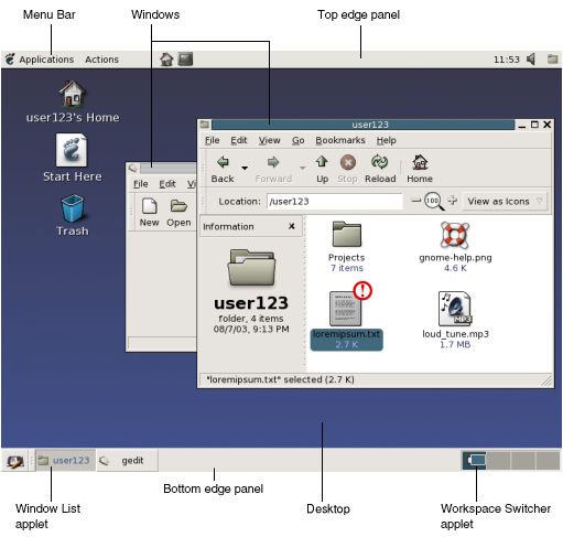
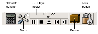
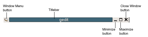
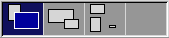
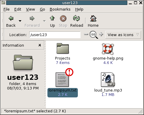


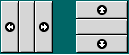
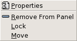
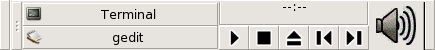


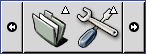
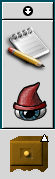
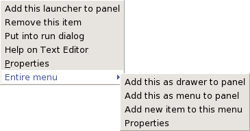
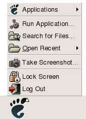
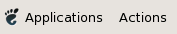
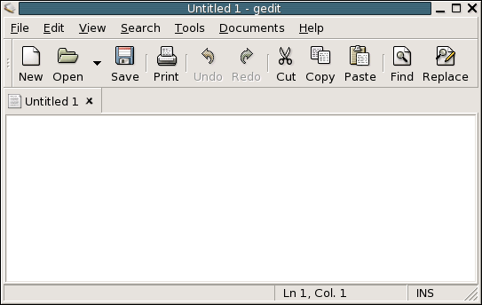
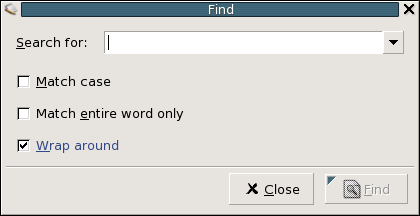
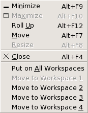

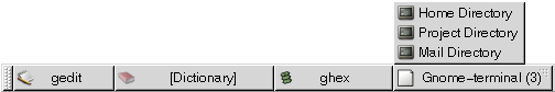
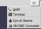
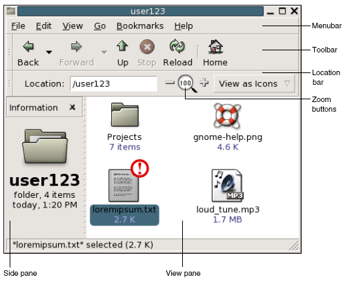
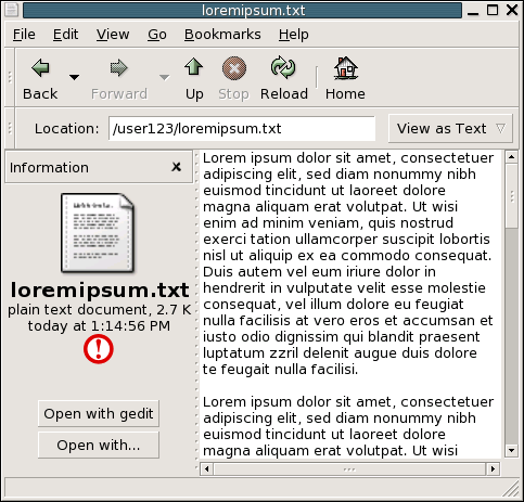


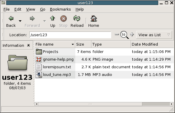
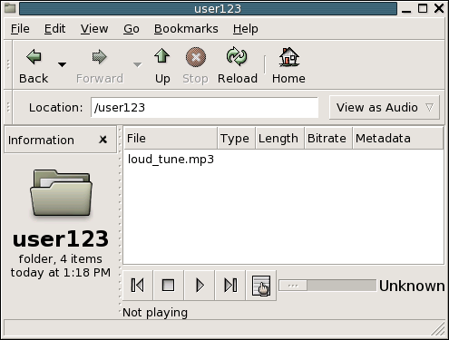